About
Kate Andersen
Creative direction for research, health, and environmental organizations.
Creative Direction
Boyd Industries, Inc.
A new tech-forward chapter for a 70+ year-old medical design company.
Creative Direction
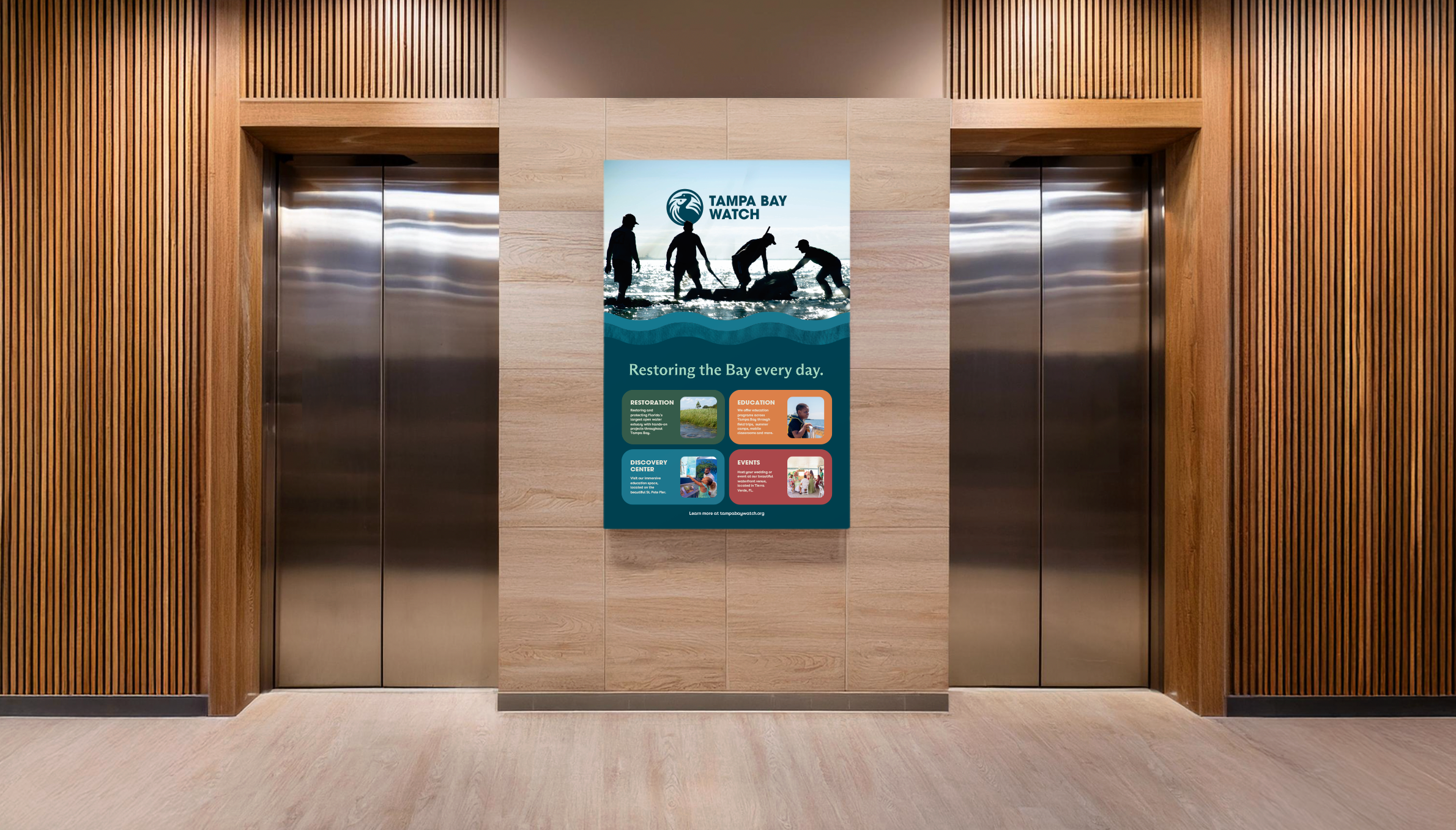
Tampa Bay Watch
An entirely new visual system for Tampa Bay's most iconic non-profit org.
Design & Development
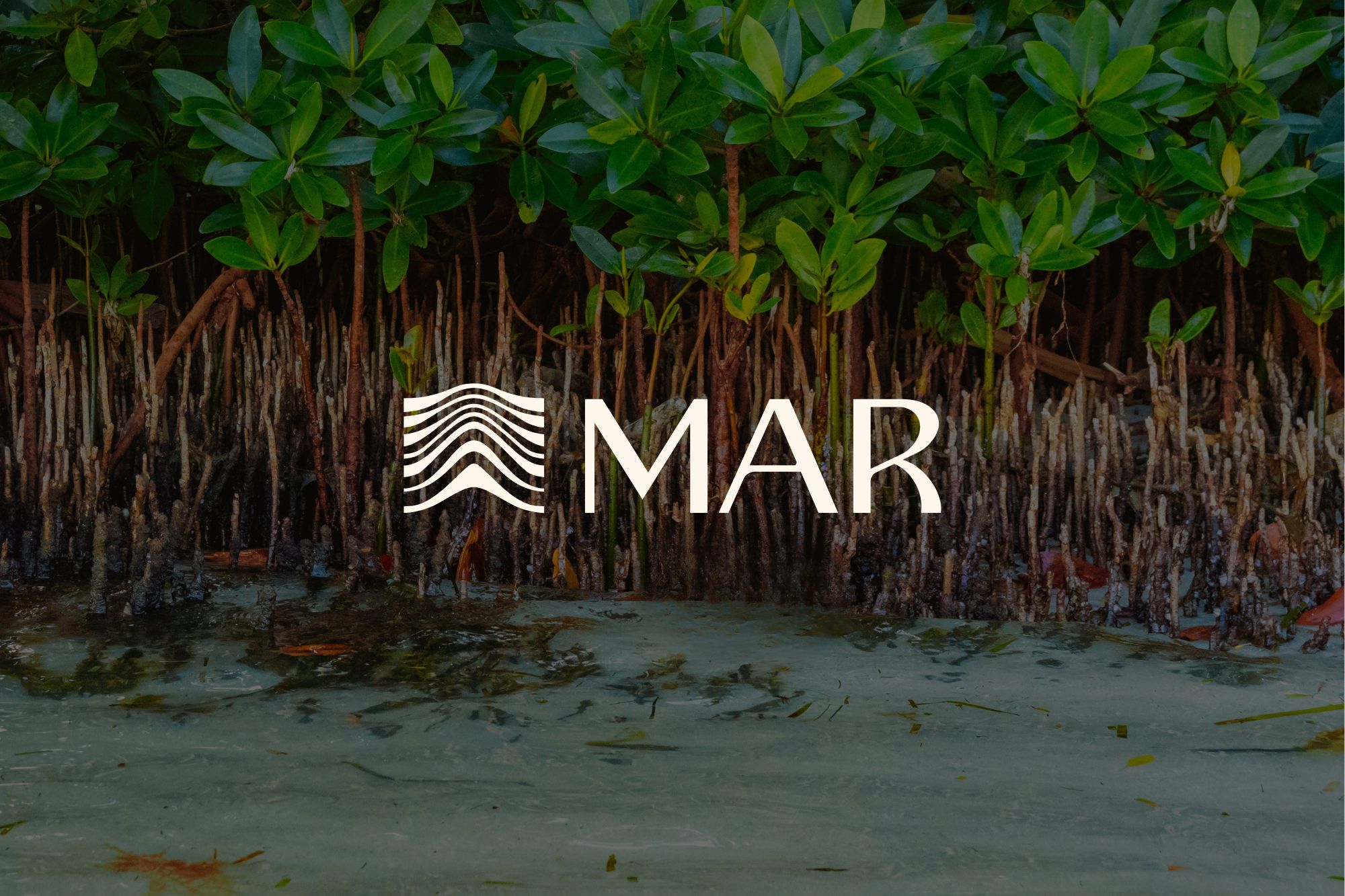
Mindful Action for Regeneration
Immersive design for the future of ecological restoration.
Brand Identity
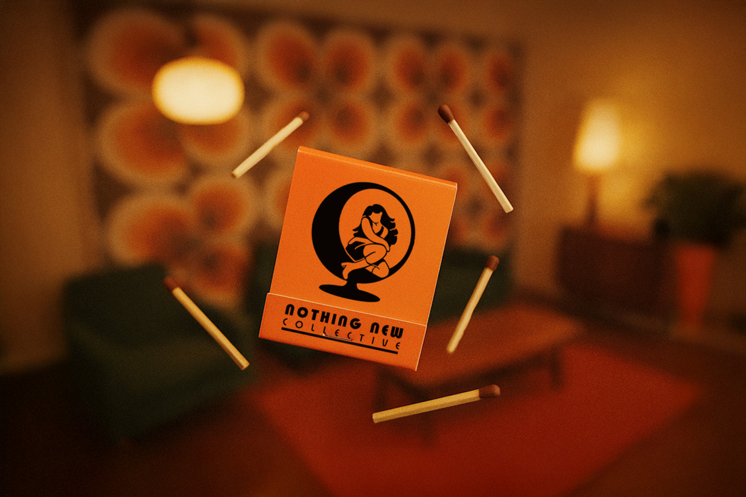
Nothing New Collective
Brand identity and digital experience design for a curated collection of designer vintage furniture.
Creative Direction
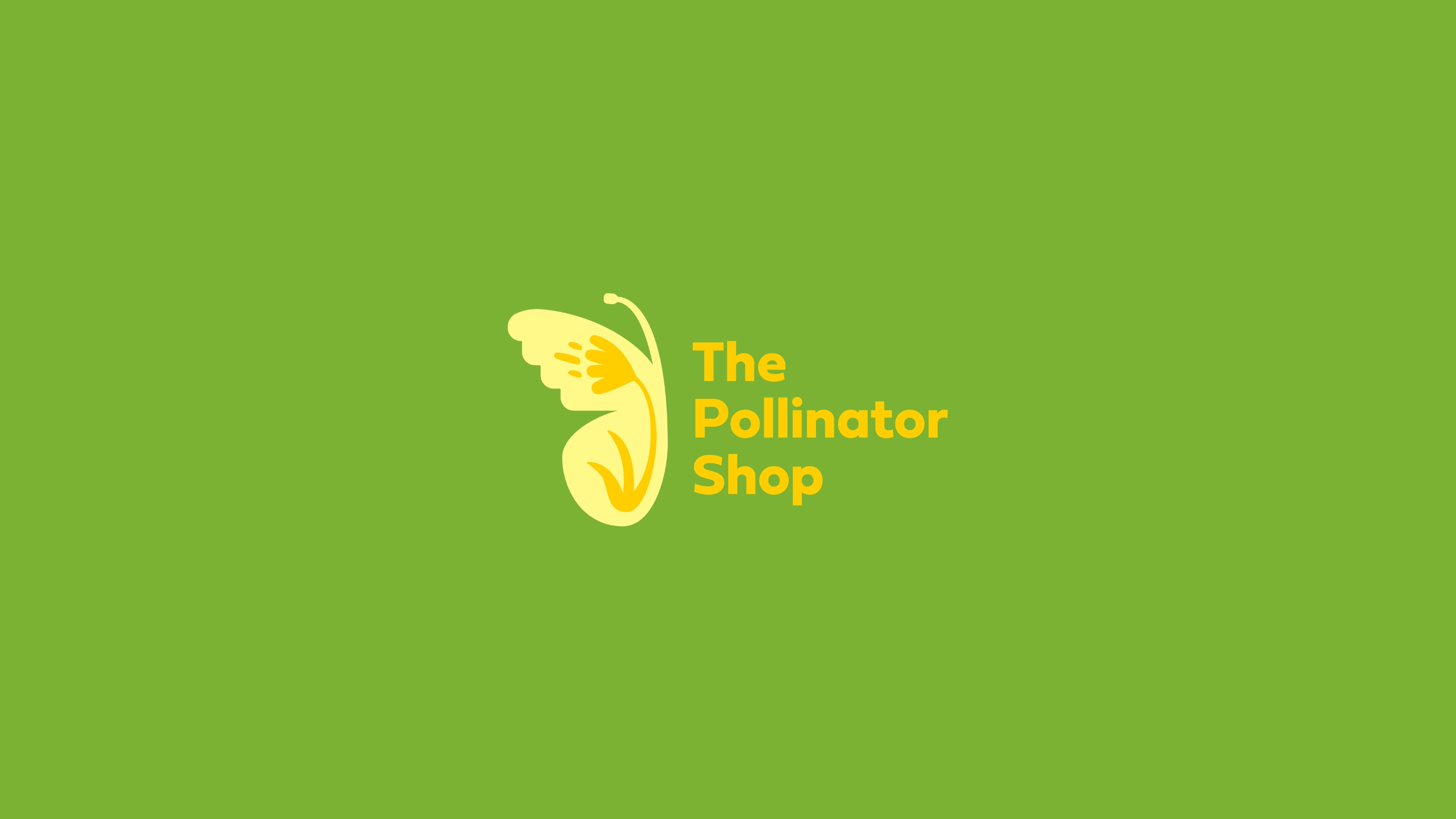
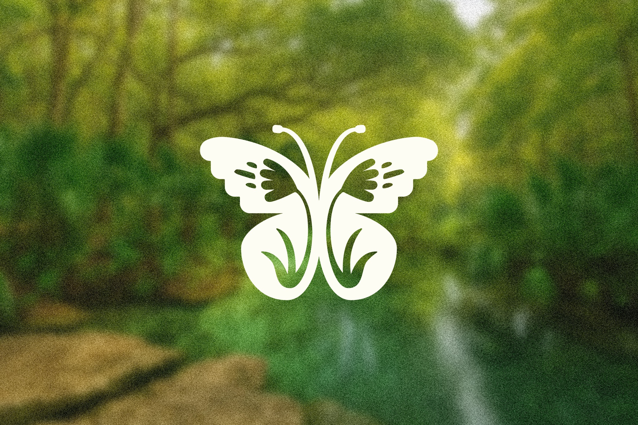
The Pollinator Shop
A brand identity and web experience designed for the modern gardener.
Visual Identity & Illustration
Oyster Boys Conservation
Extending the visual identity for a growing marine restoration organization.
Web Applications
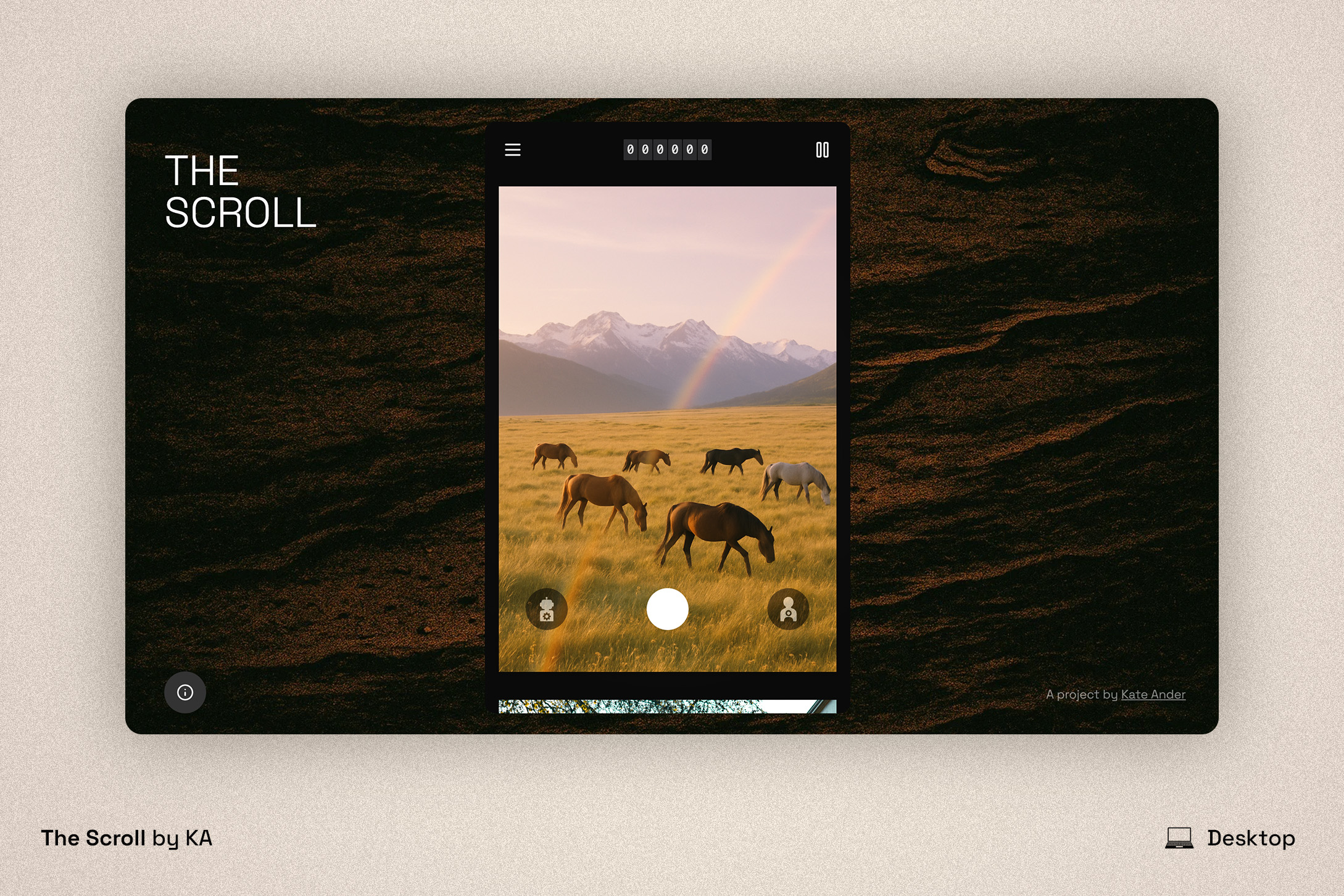
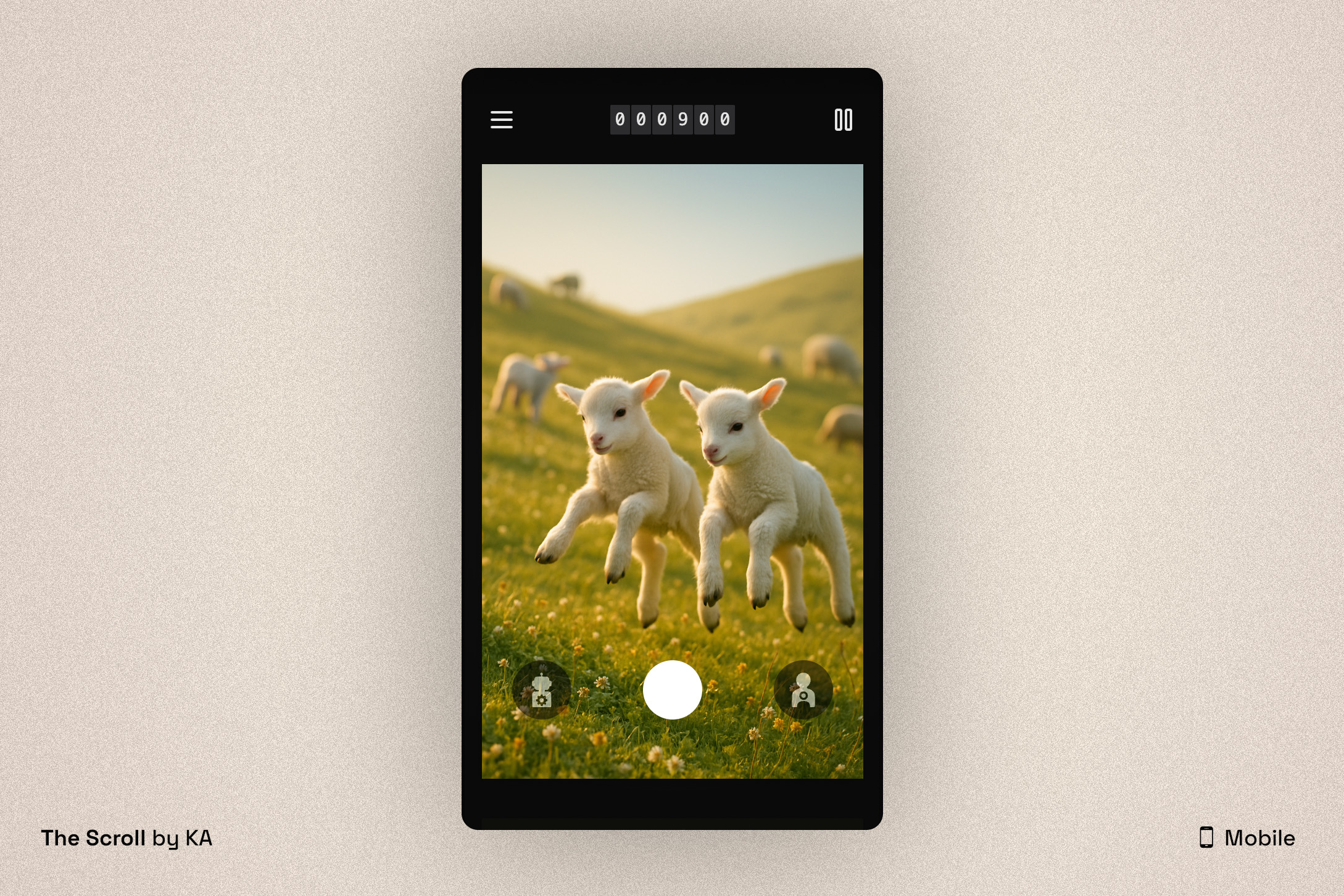
The Scroll
Exhibited at The Vestibule in Seattle, WA and visited by thousands - a web app exploring discernment in the age of AI.
Creative Direction
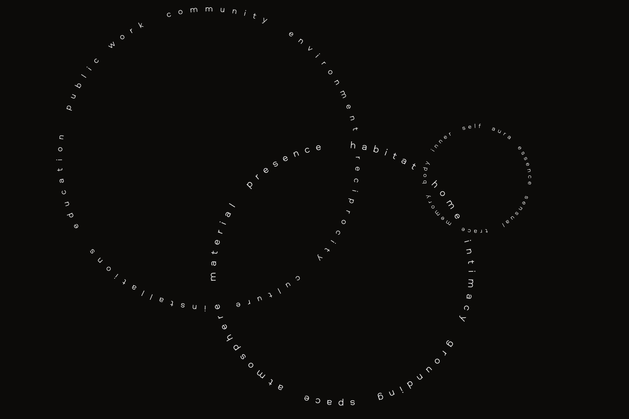
ORI
Independent design studio focused on nature-inspired and regenerative design.
Motion Design
Animation
Select from my portfolio.


Kate Andersen is a creative director and interdisciplinary designer.
She leads brand, strategy, and experience design for clients, and is the director of ORI, an independent studio exploring regenerative and biomimetic design.
Work
- Panorammma
- Boyd Industries
- Tampa Bay Watch
- MAR | Mindful Action for Regeneration
- Nothing New Collective
- The Pollinator Shop
- Oyster Boys Conservation
- Florida State University
- Eckerd College
Strategy
- Brand Strategy
- Creative Direction
- Research
Design
- Visual Identity
- UX/UI
- Motion
- Packaging
- Illustration
Spatial
- Exhibition Design
- Product Design
Resources & Contact

Studio Practice
ORI
Year
2026
Scope
- Brand Strategy
- Website Design & Development
- Art Direction
- Motion Design
ORI is my independent studio practice centered on regenerative and biomimetic design.
For this project, I developed the full brand identity, including the visual system, typography, and motion language - and designed and built the studio website from scratch. The UI, dark/light mode aesthetic, and three-pillar navigation (AURA // INTIMISM // MUNDA) were all conceived and executed as a unified design system.

Client
Tampa Bay Watch
Year
2023-2024
Scope
- Brand Strategy
- Graphic Design
- UI/UX Design
- Print Materials
- Exhibit Signage
- Photography
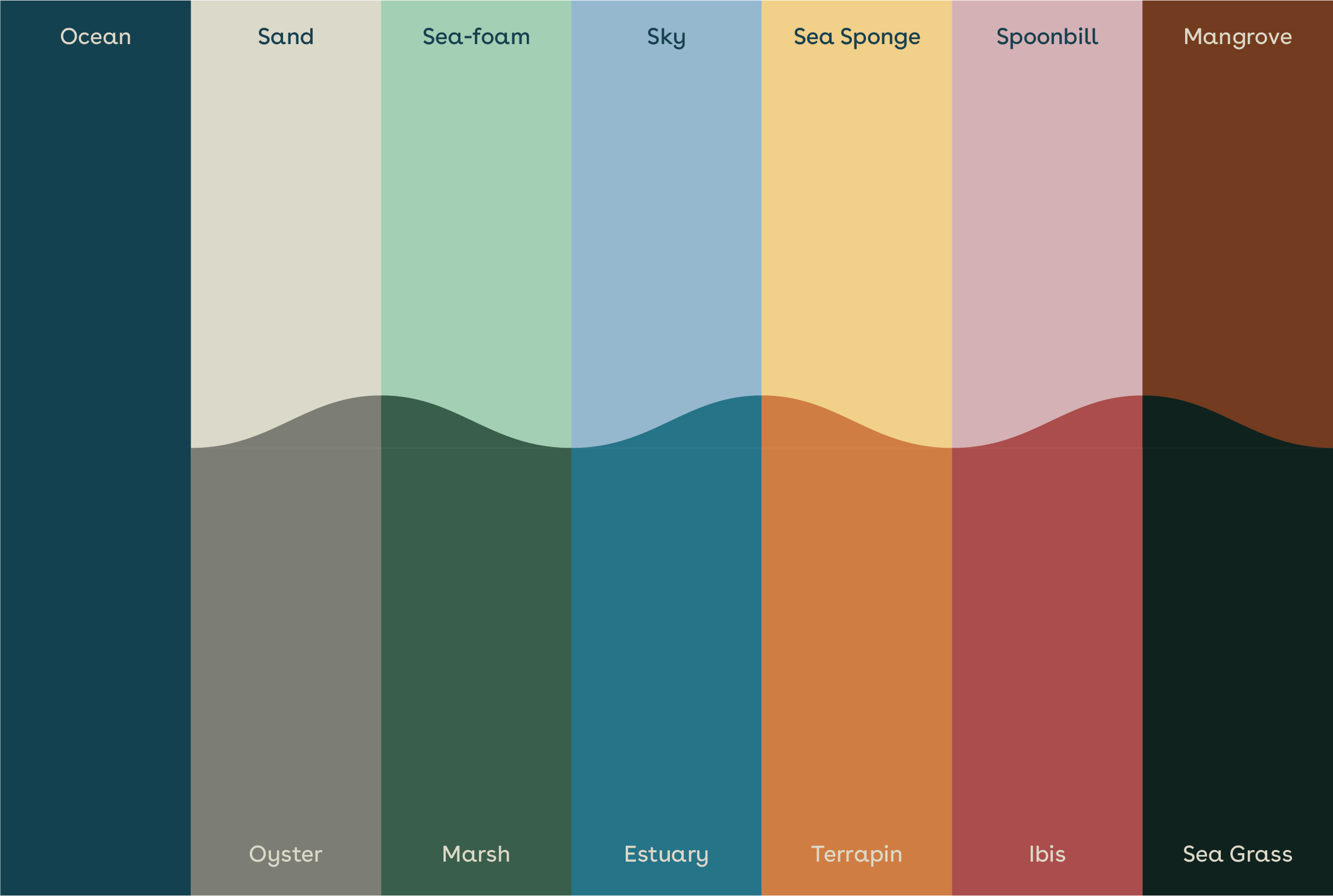
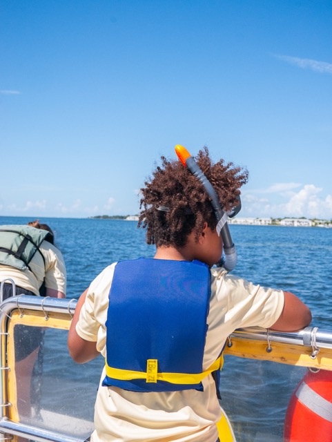
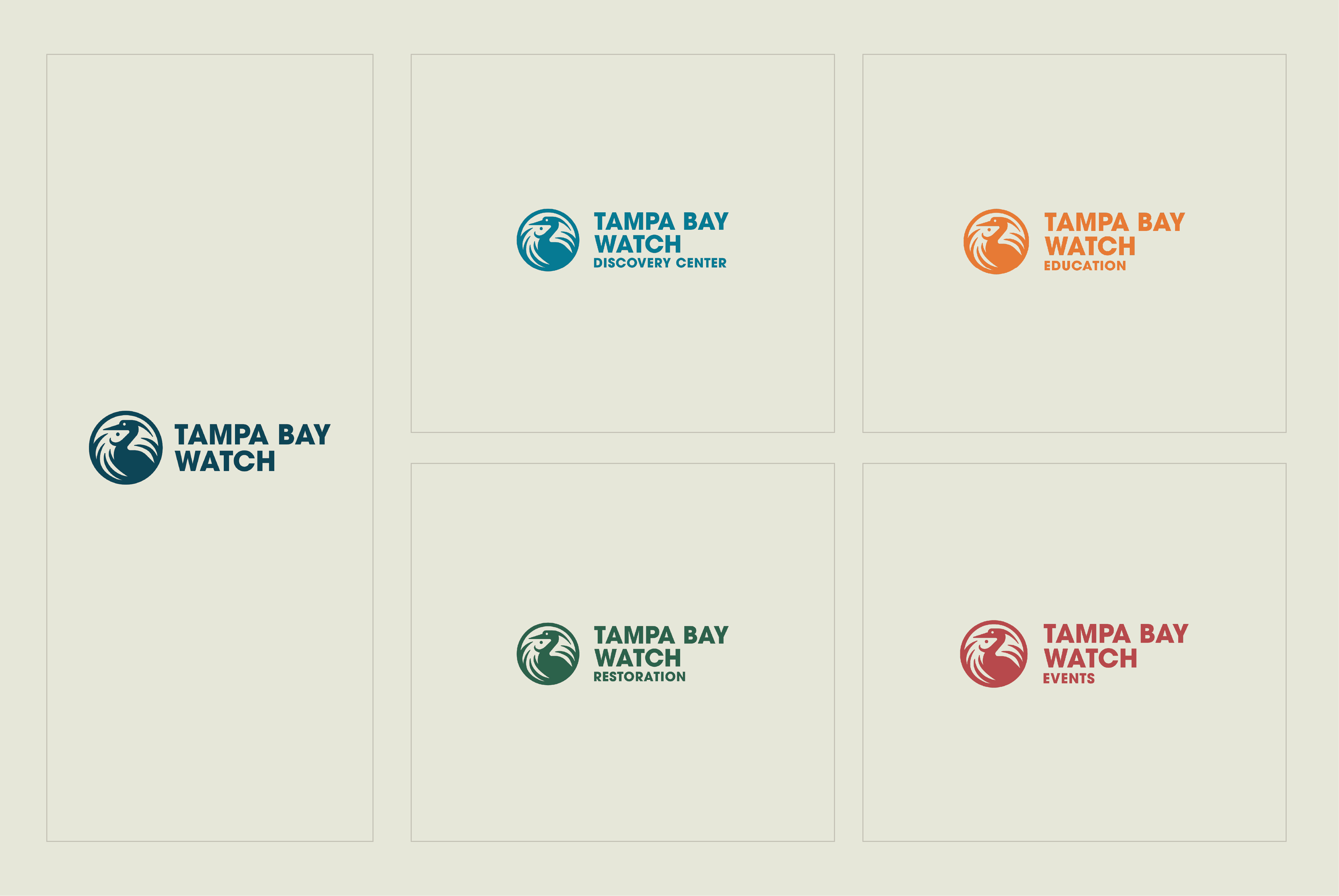
Tampa Bay Watch, a leading marine conservation organization, needed a refreshed and cohesive brand identity to better reflect their mission and impact in the Tampa Bay area.
The task was to modernize their brand while maintaining their established reputation and create a flexible system that works across educational, scientific, and community contexts—with a focus on user-centered digital experiences.
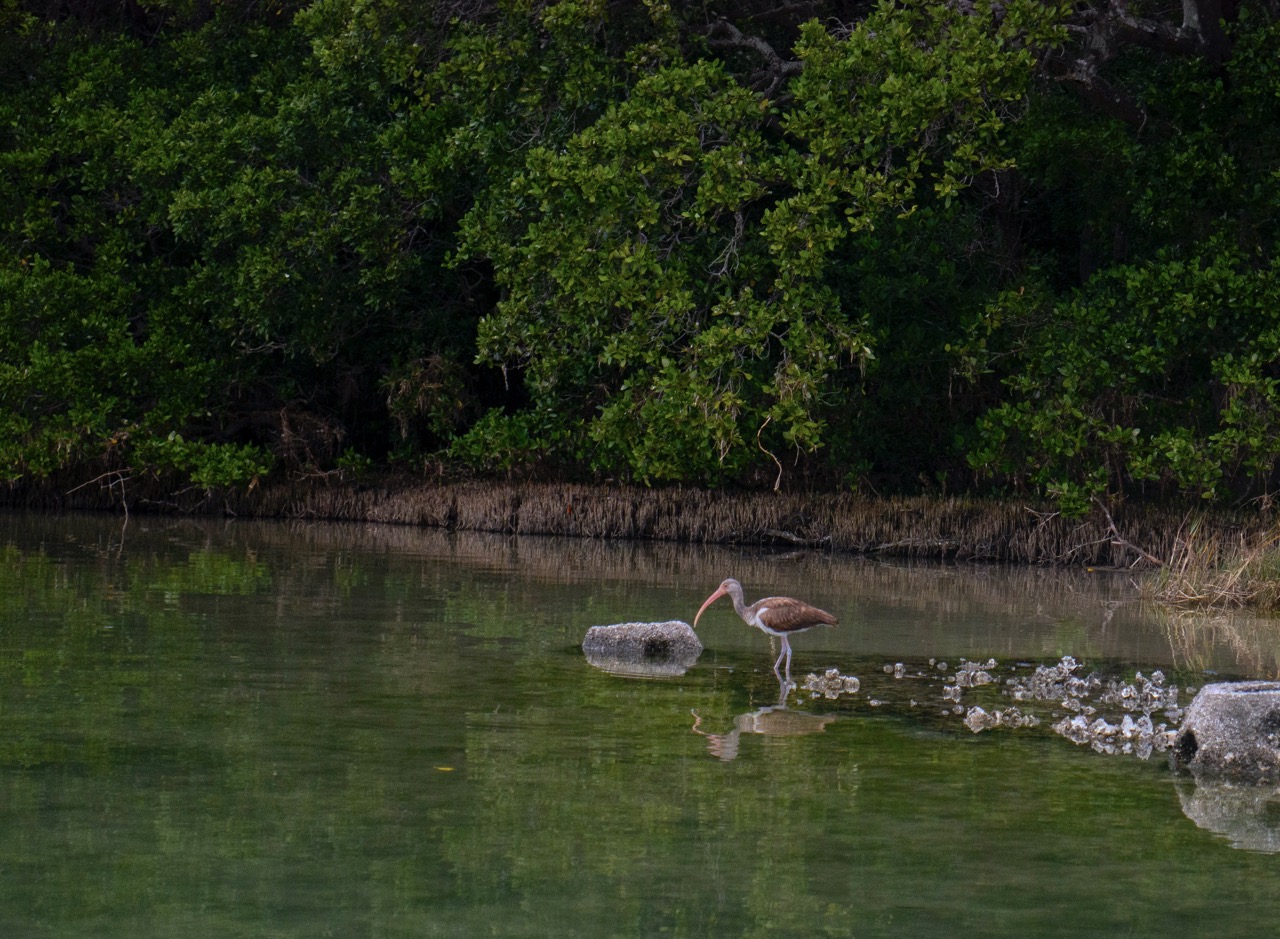
In my role as in-house Graphic Designer, I led UX/UI design for their website redesign, as well as created more consistent, modern public-facing visuals— including high-quality photography, immersive educational experiences, and a fresh brand identity designed by the team at SPARK.
Branding
SPARK Team
Elliott Bedinghaus, VP of Creative
Cameron Blank, Brand Director
Adriana Leite, Associate Creative Director
Santiago Jaramillo, Brand Designer
Candice Lockhart, Sr. Project Manager
Web Development
Jenna Rogers, Marketing Director
Kate Andersen, Graphic Designer
Tiana Kirby, Database and IT Projects Manager
Web Design
Kate Andersen
In-House Creative
Kate Andersen
Exhibit Animation
Kate Andersen
Mark Meyers
Jeanne Clark
Leah Biery
Photography
Kate Andersen
Client
Tampa Bay Watch
Project Information
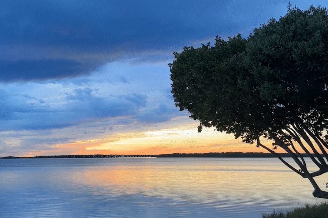
Tampa Bay Watch is a pioneering non-profit marine conservation organization dedicated to the protection and restoration of the Tampa Bay estuary. With over three decades of environmental stewardship, they needed a visual identity that could carry their mission forward while honoring their legacy.
In Spring 2023, I joined Tampa Bay Watch as an in-house designer and content creator during a pivotal moment in the organization's growth. Known for over 30 years of coastal restoration and marine education, Tampa Bay Watch had expanded its programming to include a new education center on the St. Pete Pier, additional marine science programs, and the transformation of its headquarters into a waterfront venue for eco-friendly celebrations. While these initiatives brought exciting opportunities, they also led to brand fragmentation and confusion across audiences.
Recognizing the need for clarity, I proposed a brand restructuring strategy to the CEO in Summer 2023—recommending a branded house approach that would unify the organization under a cohesive visual system. Around the same time, our marketing team discovered SPARK's Stoked campaign, which offers pro-bono branding support to nonprofits. We applied and were fortunate to be selected. Together with Jenna Rogers (Marketing Director) and Dwayne Virgint (CEO), I collaborated closely with SPARK to reimagine Tampa Bay Watch's brand—one that honors its iconic legacy and creates a sense of community among "Tampa Bay locals," human and wildlife residents alike.
Alongside the rebrand, Jenna and I initiated a full redesign of Tampa Bay Watch's website. I led the UX design and visual direction through custom wireframes and layout systems, prioritizing user flows that make complex conservation information accessible to diverse audiences. I also redesigned the Tampa Bay Watch Discovery Center website, improving both brand alignment and user experience to better serve the center's high volume of diverse visitors.
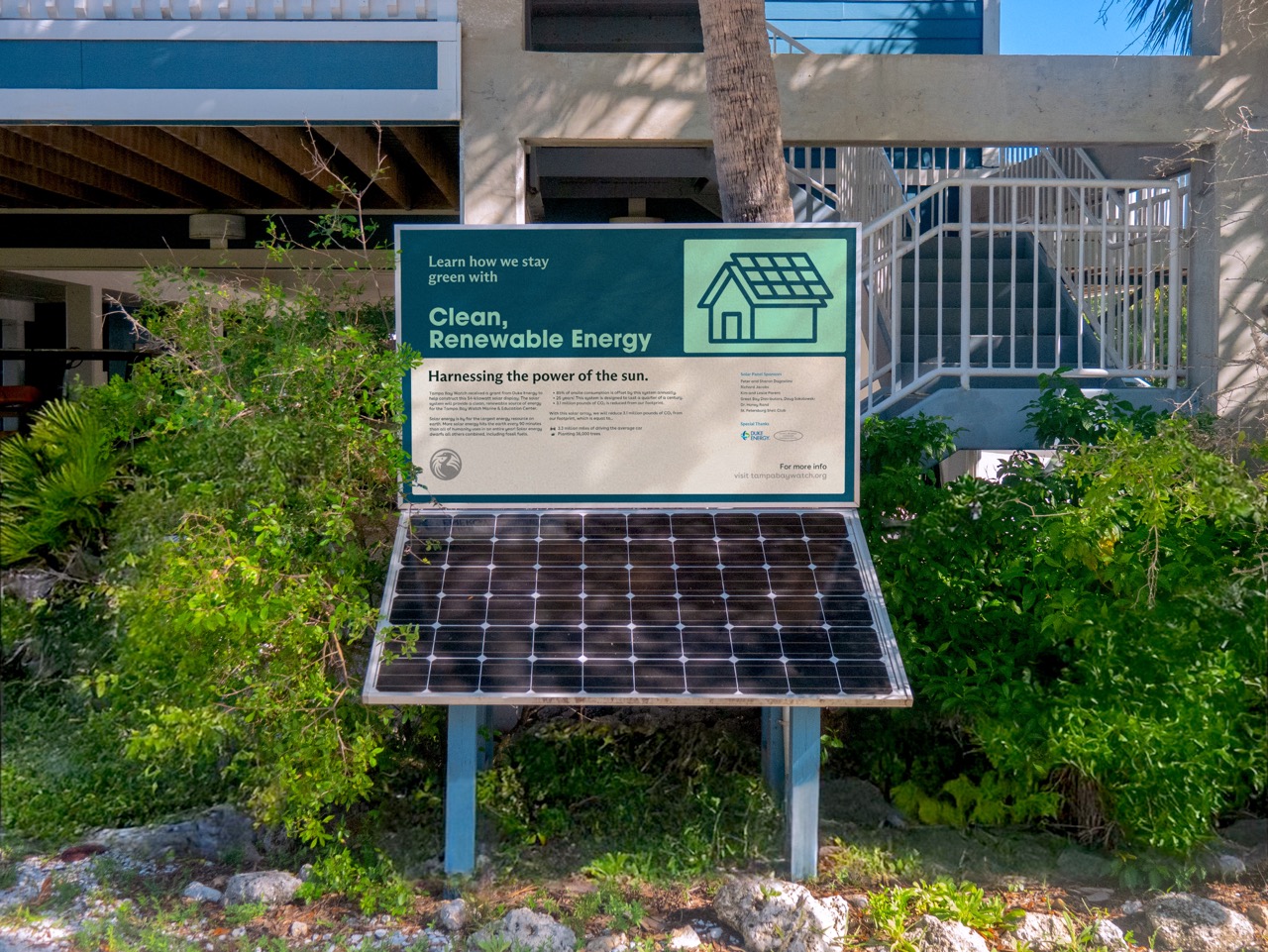
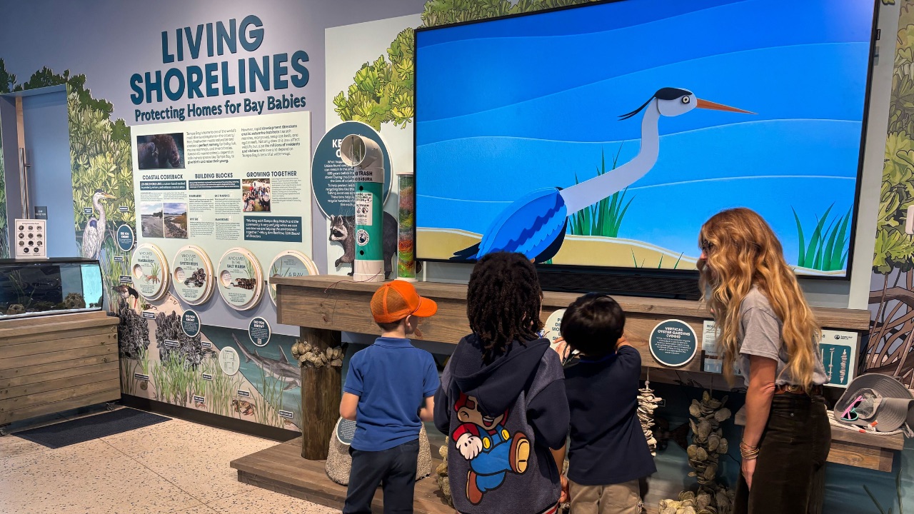
As the organization's lead creative, I oversaw all visual outputs to ensure brand consistency across platforms. This included designing educational signage, marketing collateral, merchandise, and digital content—all with a focus on user-centered design that makes environmental action feel approachable. I also directed two educational animations featured at the Discovery Center, located on the St. Pete Pier—a destination that draws millions annually.
The resulting work reflects a unified, flexible brand that communicates clearly with a wide range of audiences—from school children to scientific partners—while staying grounded in the beauty and purpose of the bay we work to protect.
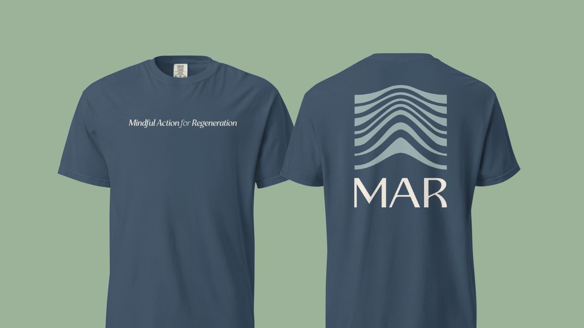
Client
Mindful Action for Regeneration
Year
2026
Scope
- Spatial Design
- Web Design and Development
- Merchandise and Print
- Photography
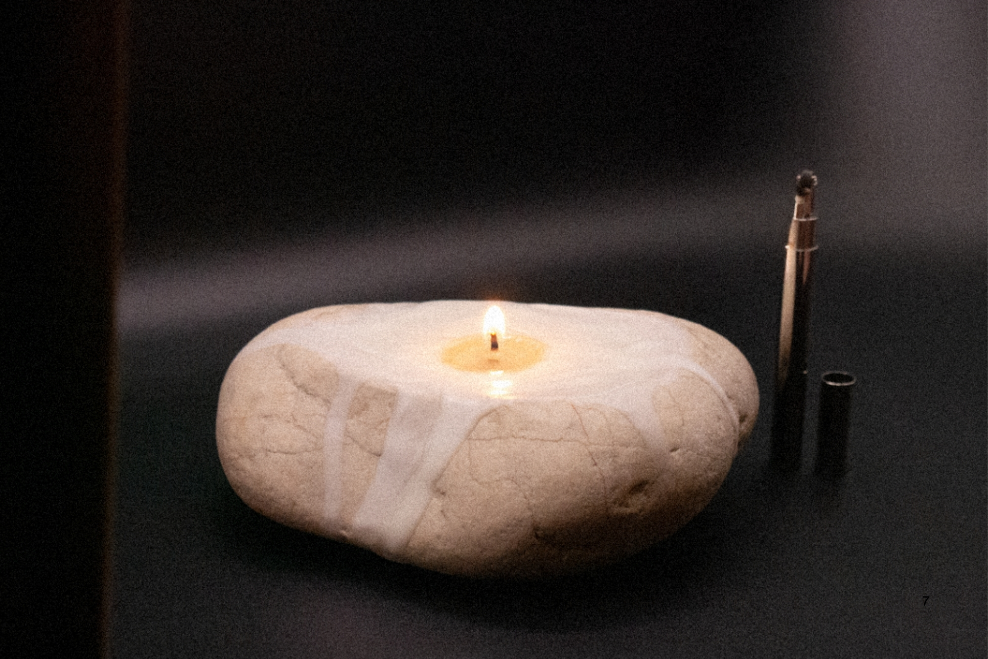
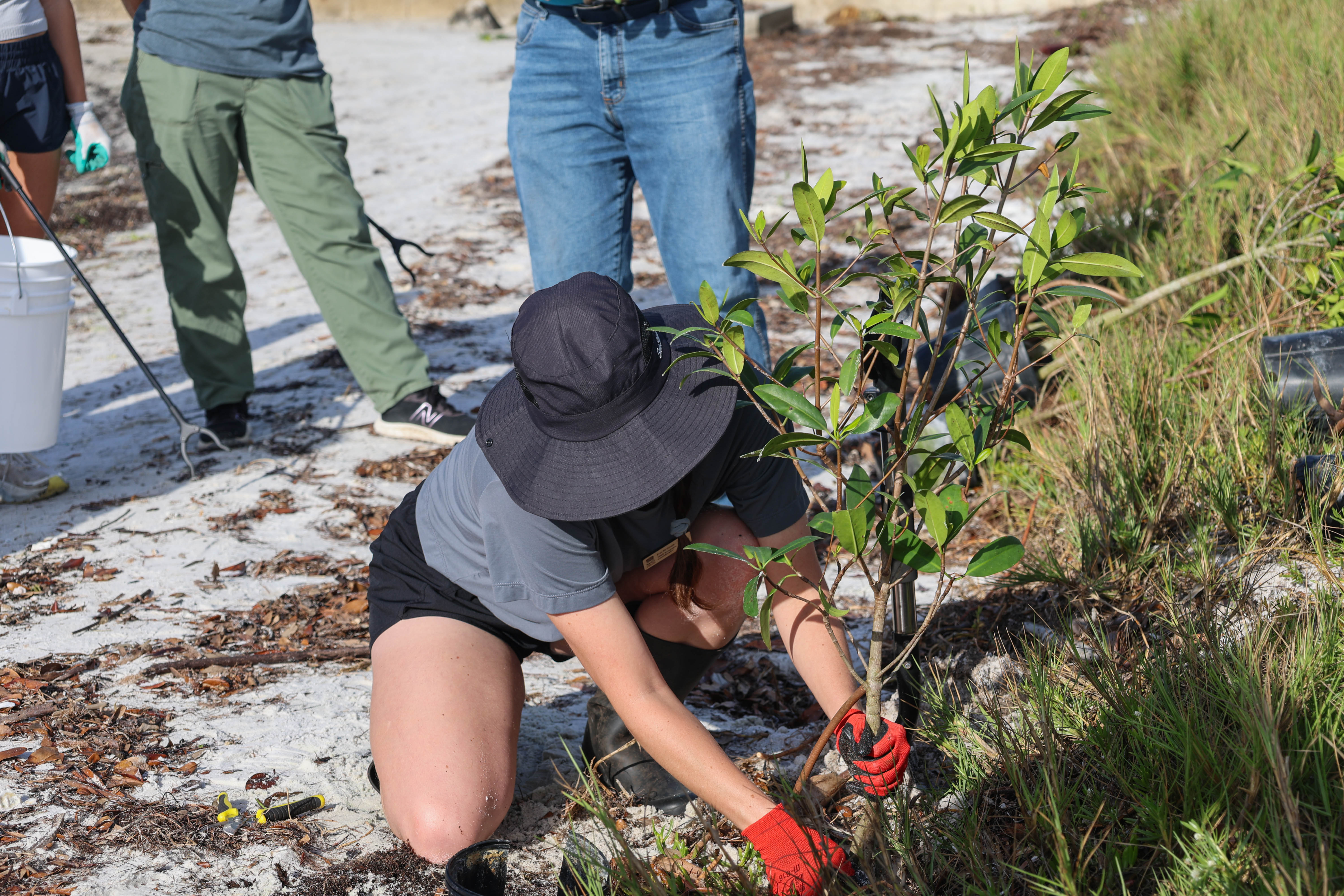
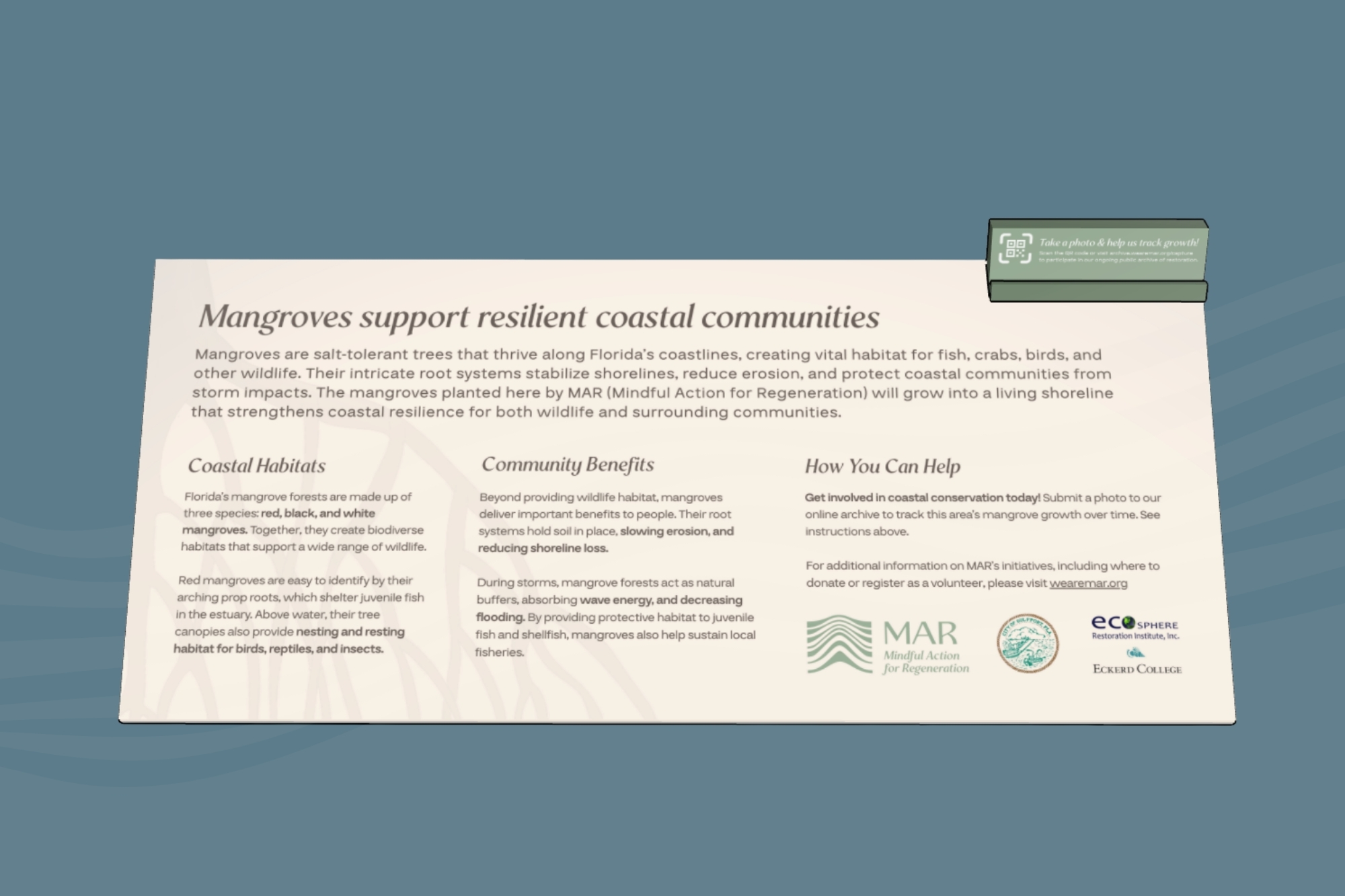
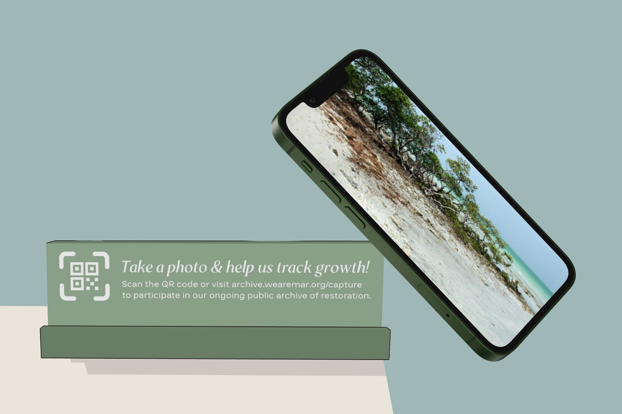
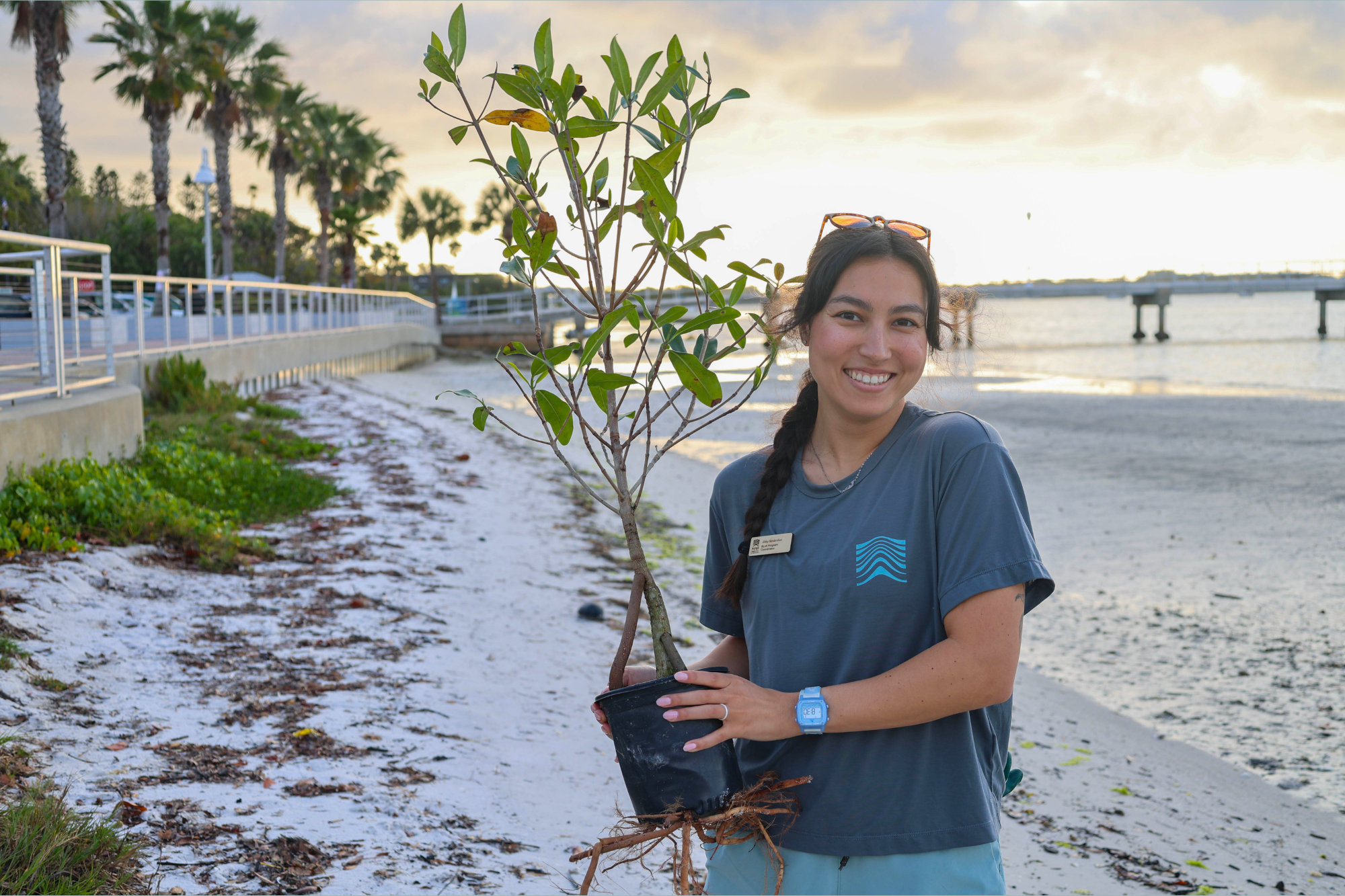
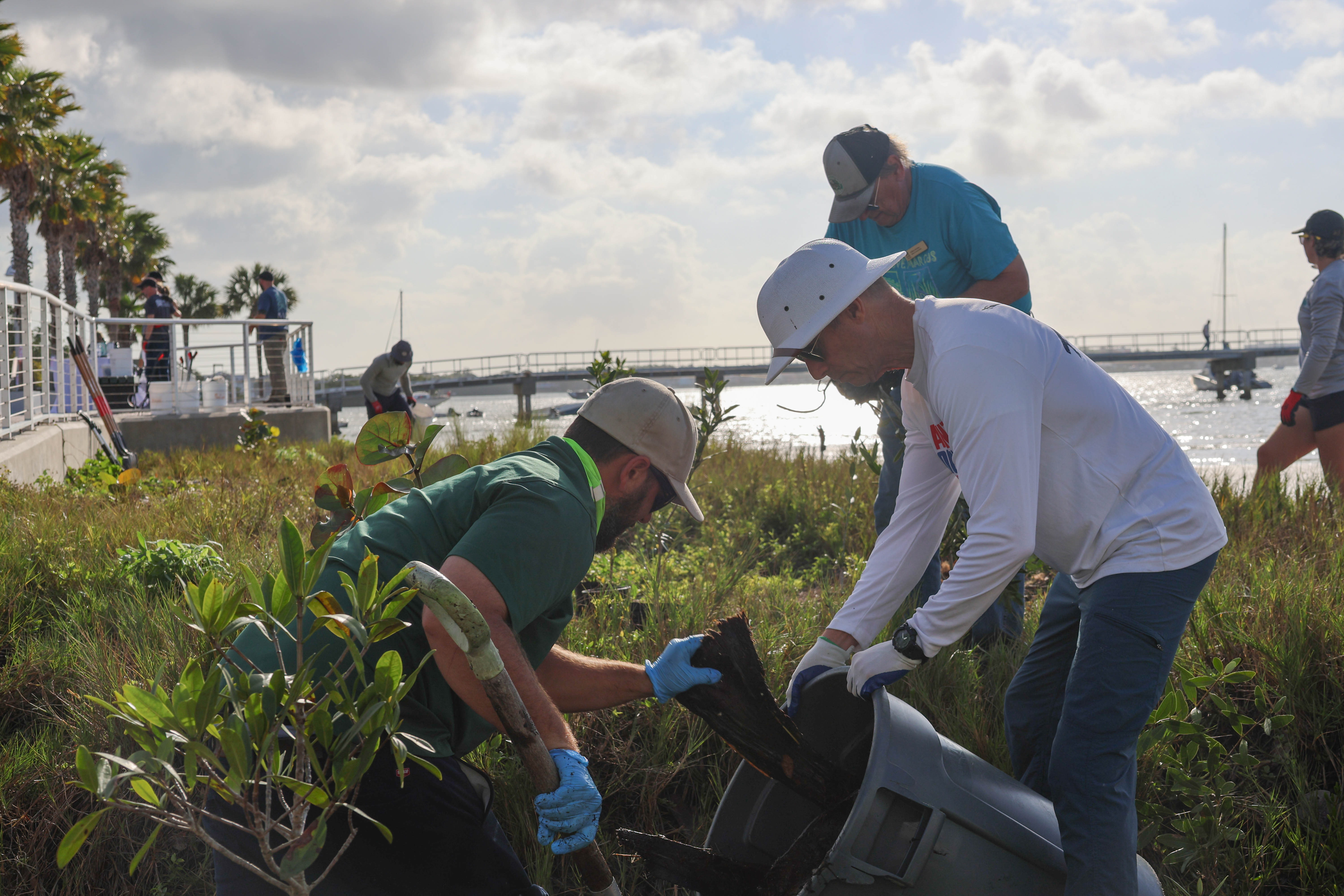
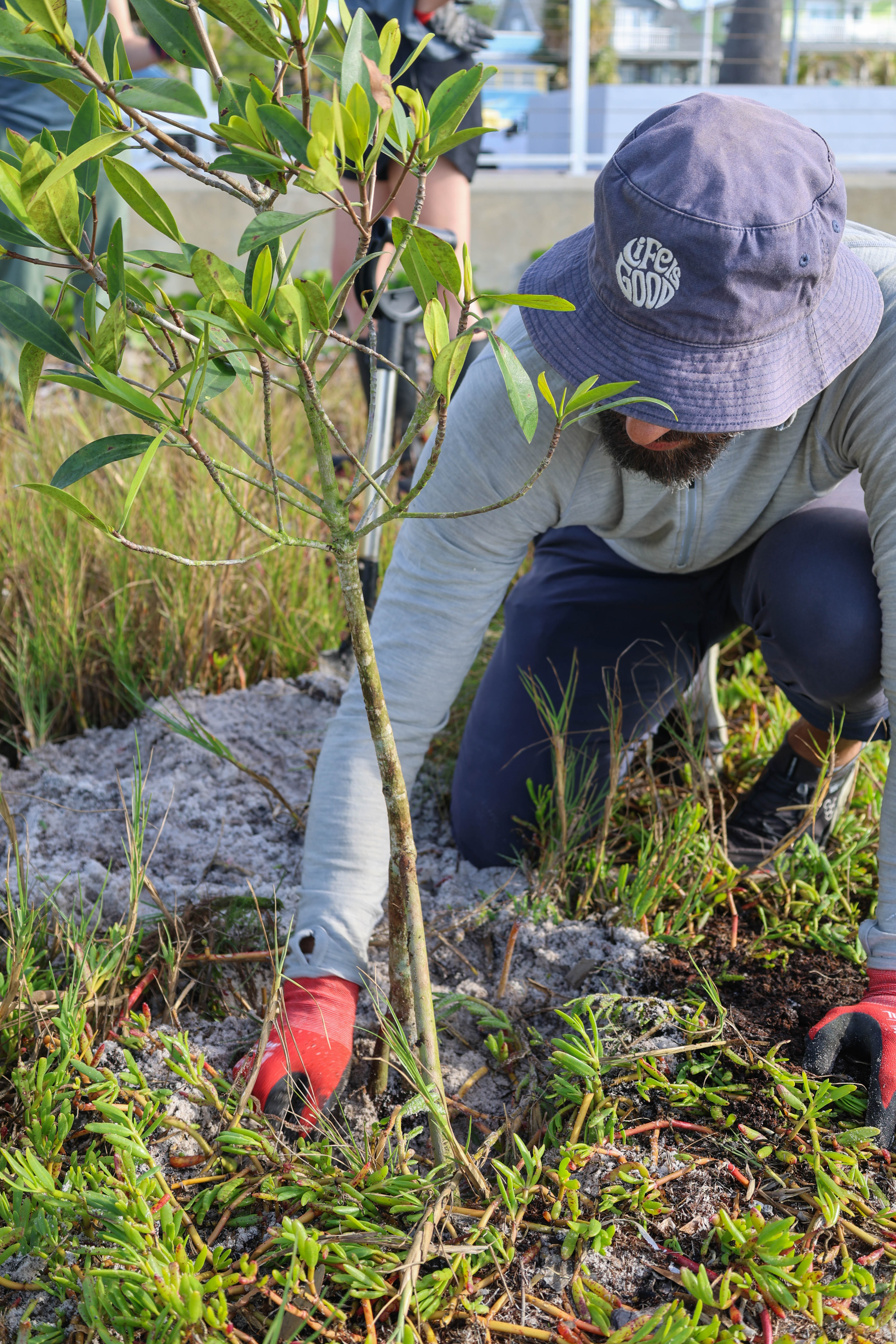
Mindful Action for Regeneration (MAR) is a Florida-based non-profit dedicated to connecting people with nature to restore ecosystems, remove invasive species, and plant native trees.
Since 2025, I've worked with MAR as a creative partner across print, merchandise, and interpretive signage.
For their Gulfport mangrove restoration site, I designed installation signage and developed an interactive digital archive from scratch. Visitors can photograph the site and contribute to a living record of its recovery over time - directly from the installation via QR code.
Designer
Kate Andersen
Client
Mindful Action for Regeneration
Project Information
Mindful Action for Regeneration (MAR) connects Tampa Bay residents with nature through volunteer days, workshops, and community gatherings - restoring native habitats and building environmental stewardship along the way.
Our collaboration has spanned merchandise, event photography, and environmental graphics. That included an interpretive sign for their Gulfport coastal restoration site, paired with a phone stand and QR code linking to a "living archive." There, visitors can act as citizen scientists by submitting photos and watching the site change over time.
The everyday goal is to help make regenerative action visible, approachable, and collective.

Client
Nothing New Collective
Year
2024
Scope
- Visual Identity
- Logo Design
- Print Materials
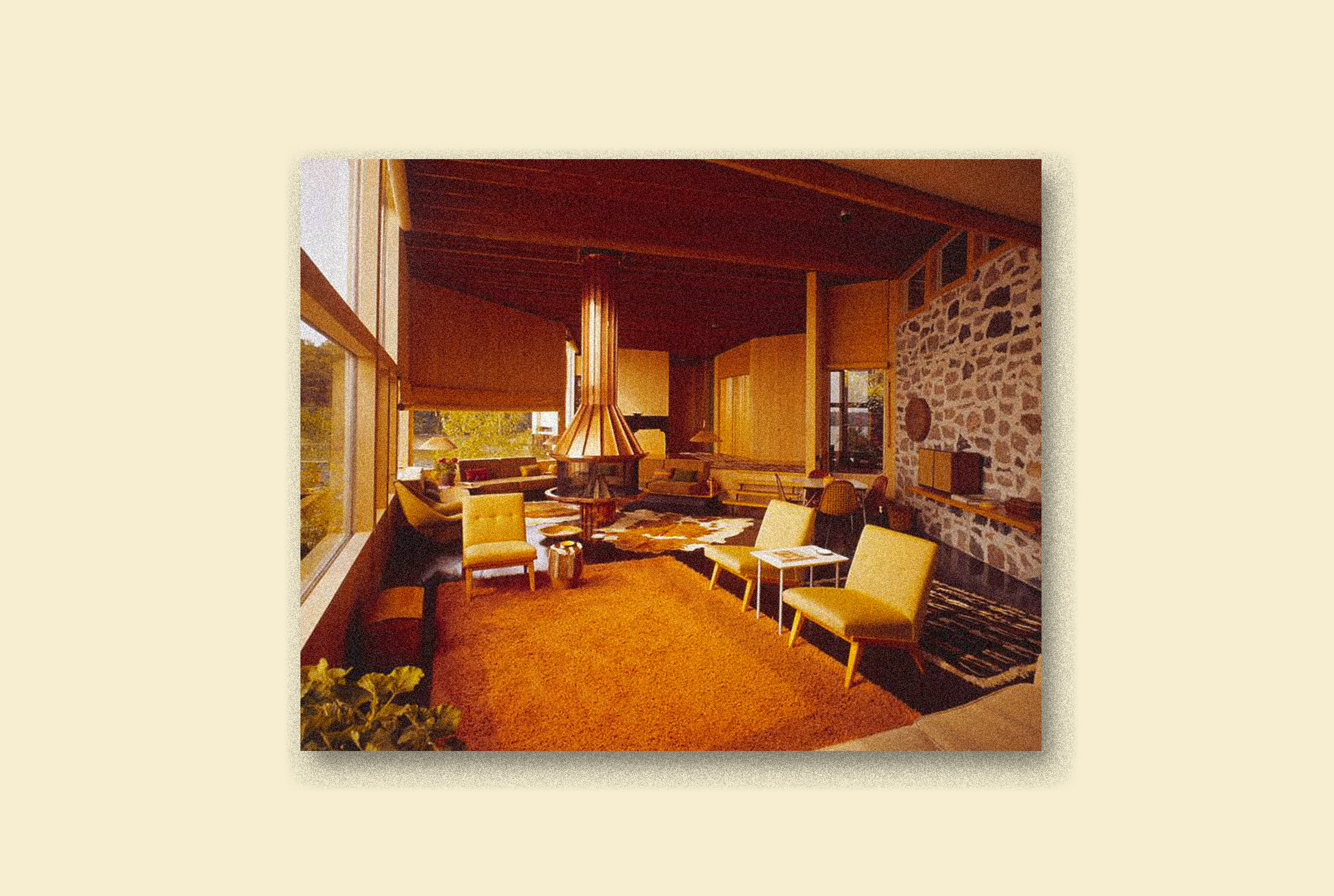
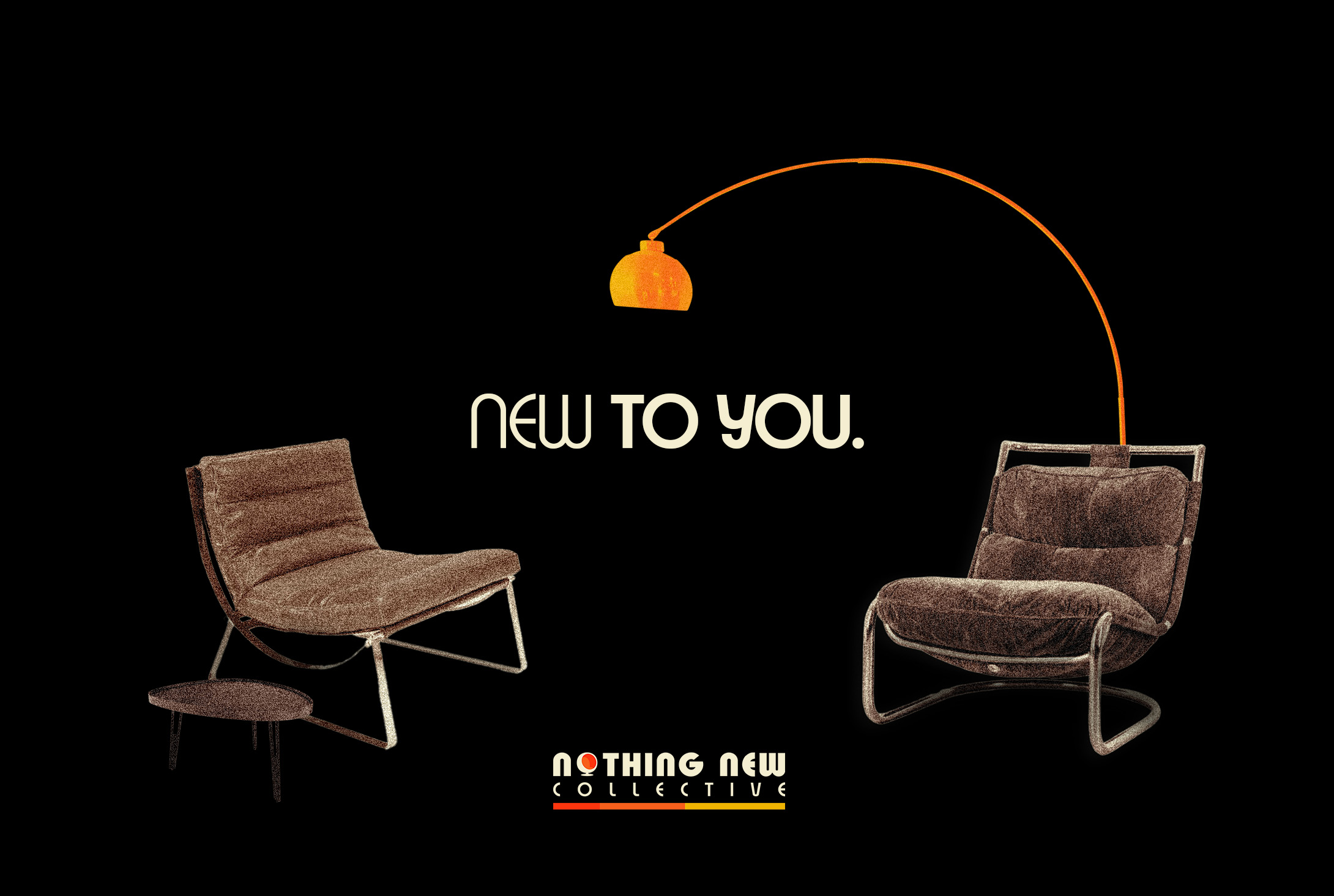
Nothing New Collective, St. Petersburg's iconic vintage furniture shop, needed a brand identity that reflected their curated collection of mid-century modern pieces.
The goal was to create a visual system that balanced contemporary design with vintage aesthetics, while establishing a strong digital presence through social media that make vintage shopping feel modern and accessible.
Creative Direction
Kate Andersen
Design
Kate Andersen
Photography
Pexels Public Domain
Library of Congress Prints & Photographs
Client
Nothing New Collective
Robert Lower, Founder
Project Information
Nothing New Collective represents a unique intersection of vintage curation and modern retail in St. Petersburg's thriving design scene. As the city's premier vendor for mid-century modern furniture, they needed a brand identity that could bridge the gap between historical appreciation and contemporary aesthetics.
The visual identity system draws inspiration from the clean lines and organic forms characteristic of mid-century design, while incorporating a more contemporary and playful illustration style that appeals to St. Petersburg's design-conscious consumers. The color palette balances warm, nostalgic tones with crisp, modern graphic elements.
Typography plays a crucial role in the identity, with the use of Expressa, an iconic and period-appropriate typeface, combined with modern typographic principles that prioritize readability and accessibility. This approach creates a visual language that feels both timeless and current—much like the pieces in Nothing New's carefully curated collection.
The system extends across all customer touchpoints, from in-store signage to digital platforms, creating a cohesive user experience that elevates the brand beyond traditional vintage retail. The result is an identity that honors design of the past while still establishing Nothing New Collective as a contemporary design destination.
Client
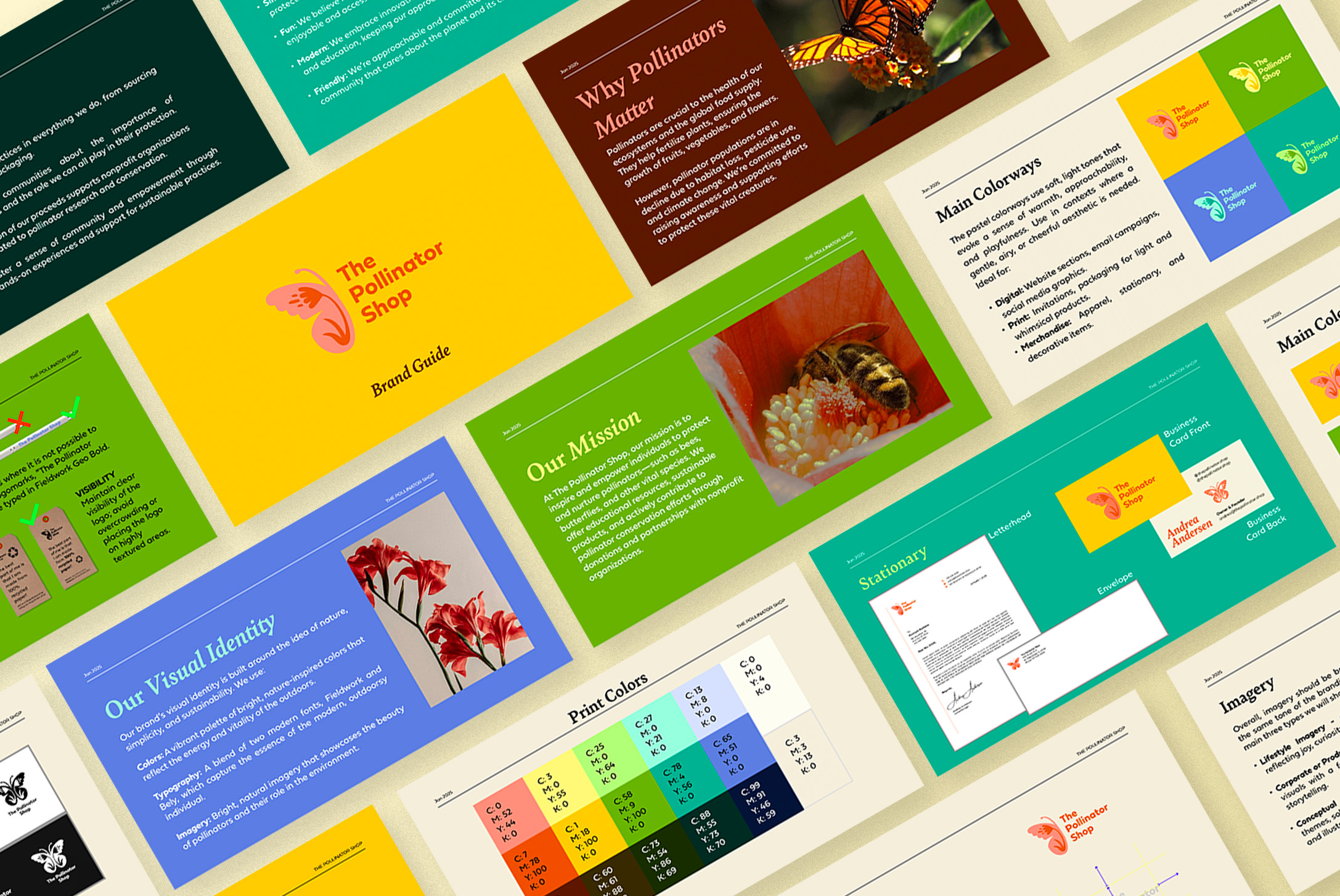
The Pollinator Shop
Year
2024
Scope
- Brand Strategy
- Visual Identity
- Product Design
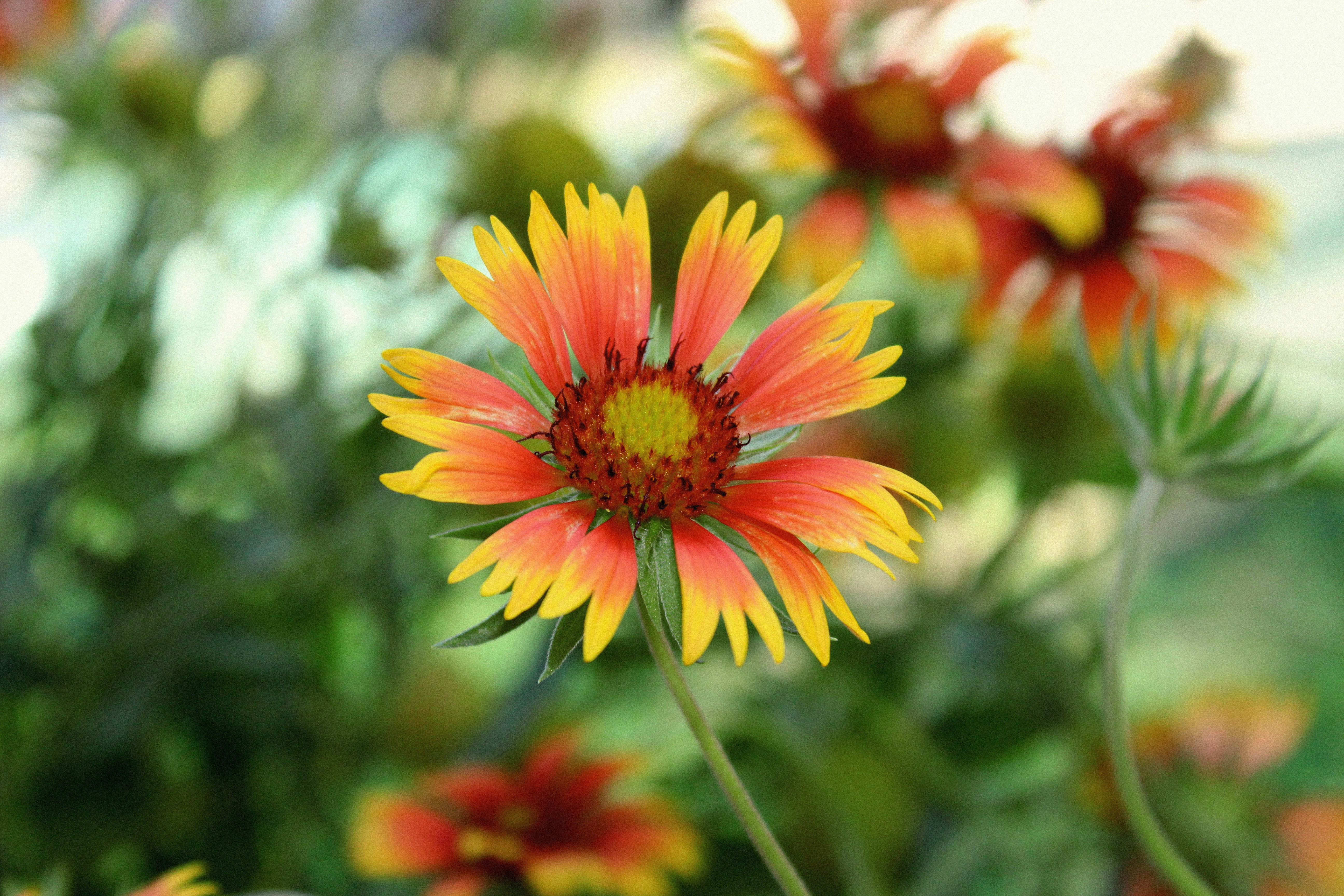
The Pollinator Shop needed a brand identity that would appeal to homeowners and plant lovers. The goal was to educate and inspire them to plant pollinator-friendly, native plants in their yards through intuitive, user-centered design.
We created a colorful, cohesive visual system that works across product packaging, merchandise, and educational materials while maintaining a contemporary, clean, and eco-conscious aesthetic—designed to make regenerative action feel accessible and engaging.
Creative Direction
Kate Andersen
Design
Kate Andersen
Packaging Design
Kate Andersen
Photography
Kate Andersen
Pexels Public Domain
Client
The Pollinator Shop
Project Information
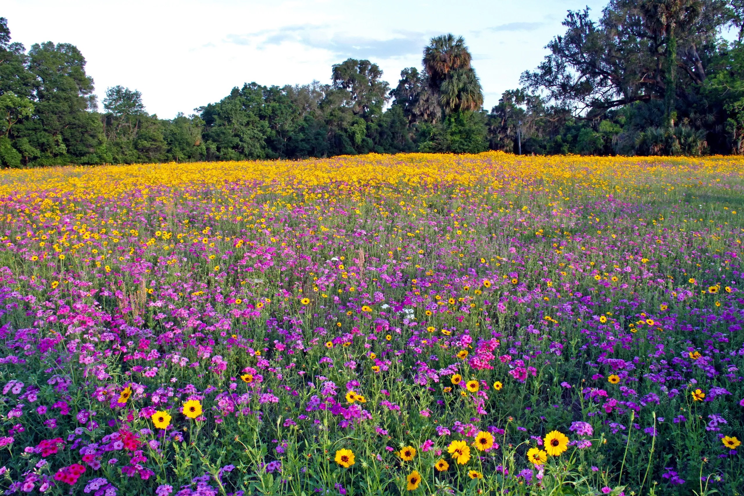
The Pollinator Shop began with a simple yet powerful goal: to inspire individuals to protect pollinators through everyday action. These creatures are essential to our ecosystems, but are often overlooked. I was brought on to help shape a brand that could bridge the gap between education, sustainability, and design—to help make pollinator advocacy approachable, actionable, and beautiful.
The challenge was to develop an identity that spoke to both seasoned gardeners and curious newcomers, while conveying the ecological urgency of pollinator conservation. The visual system draws from organic forms and natural geometry, creating a look that's refined yet friendly—scientific but not sterile. The tone is intentionally empowering, rooted in the belief that small-scale urban gardening can have a meaningful ecological impact.
From brand identity to product packaging and digital content, I designed a cohesive system that champions eco-friendly materials and intuitive, user-centered design. Every touchpoint—from seed kits to signage—is crafted with user experience in mind, making it easy for people to understand pollinator-friendly practices.
A portion of the shop's proceeds supports pollinator conservation through nonprofit partnerships, reinforcing the brand's mission at every level. The result is a unique combination of company and community, empowering pollinator stewardship one garden at a time.

Client
Oyster Boys Conservation
Year
2025
Scope
- Visual Identity
- Merchandise Design
- Illustration
Oyster Boys Conservation needed a design that offered variety for their merch. The goal was to create a design that resonates with their community, generates revenue, as well as captures the organization's evolving and growing mission through user-centered visual storytelling.
We hoped to elevate the brand's visual identity, creating a segue into a new chapter for the organization, without completing a full rebrand.
Creative Direction
Kate Andersen
Design
Kate Andersen
Illustration
Kate Andersen
Client
Oyster Boys Conservation
Dominic Marino, President & CEO
Abby Hendershot, Operations Coordinator
Project Information
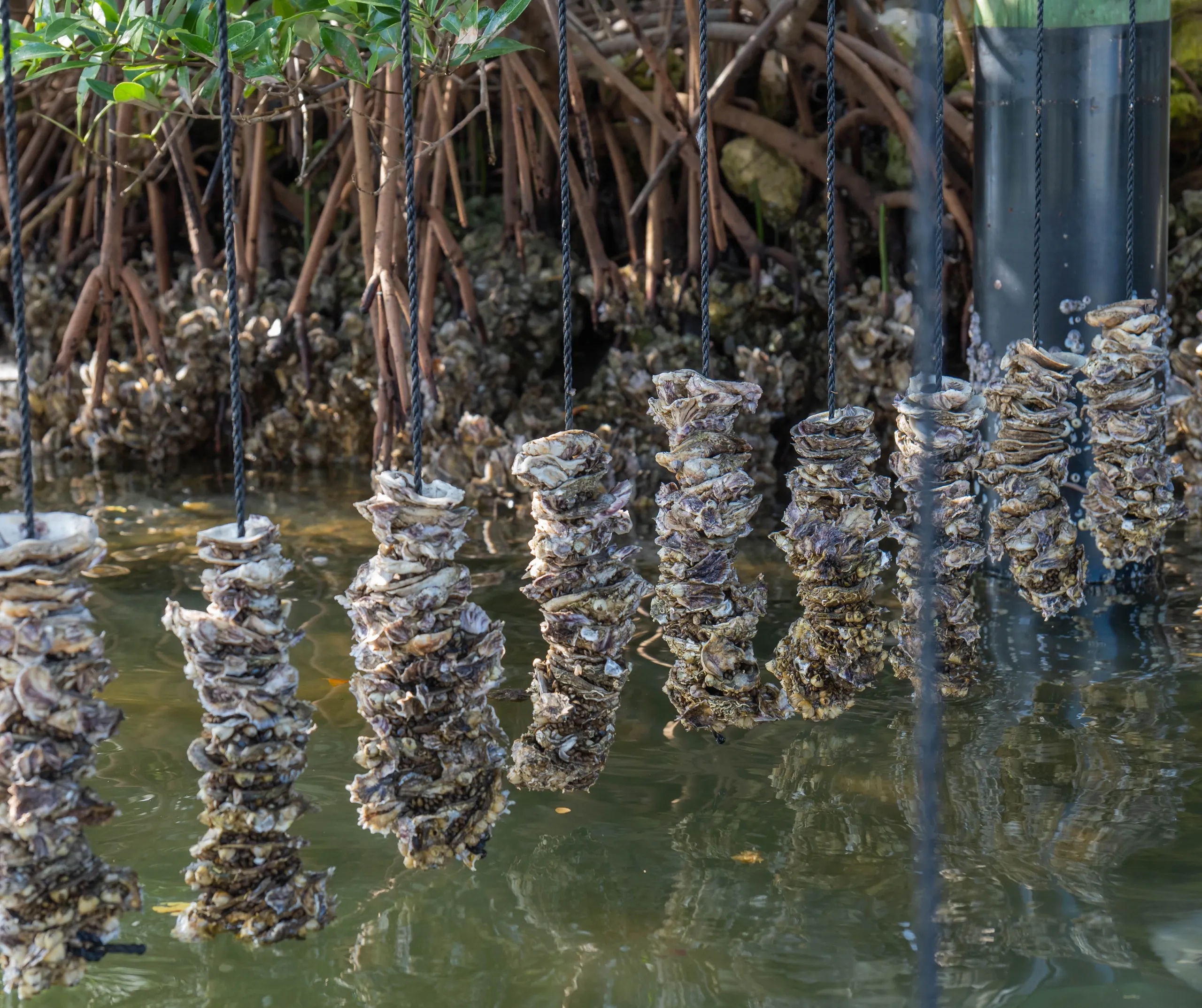
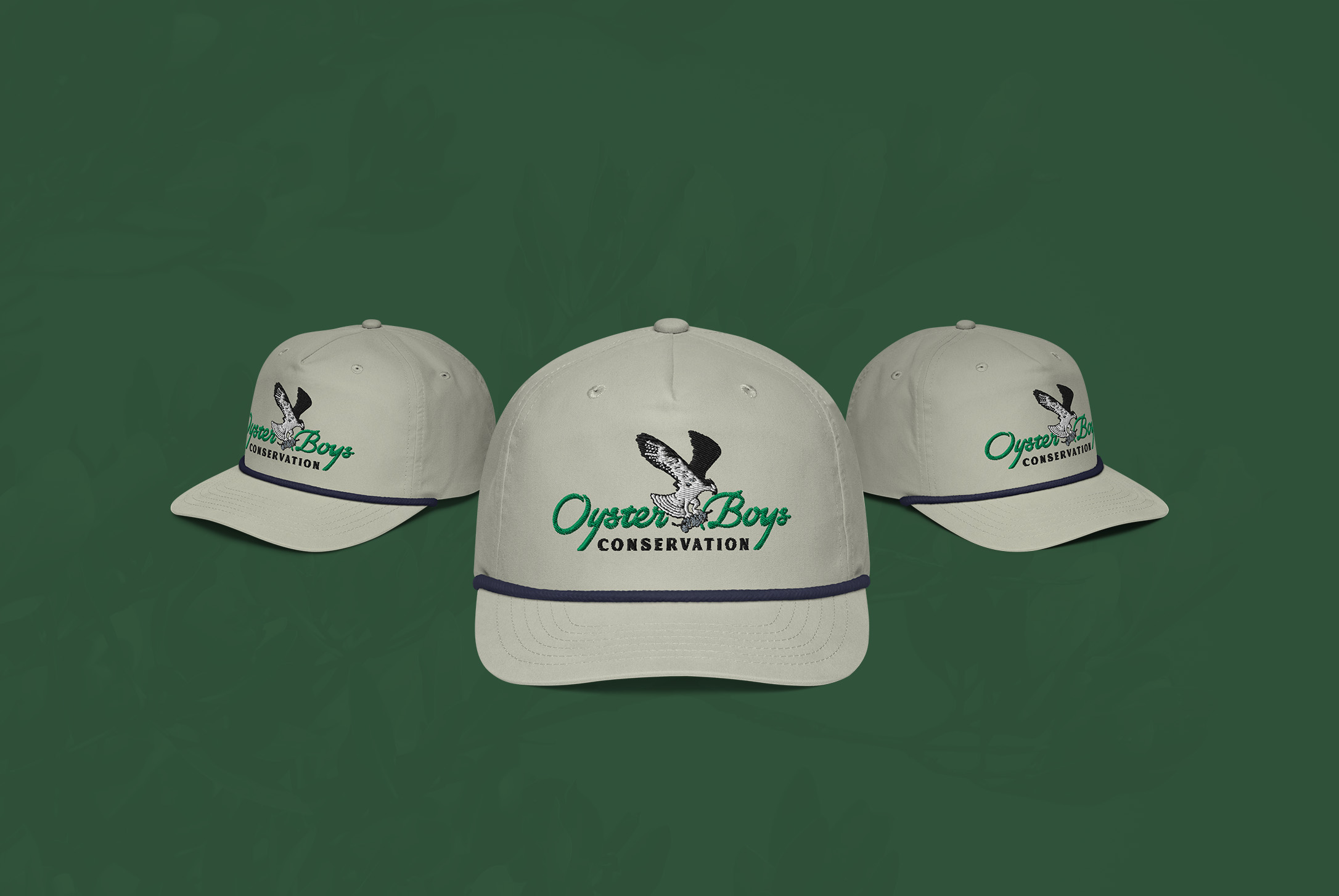
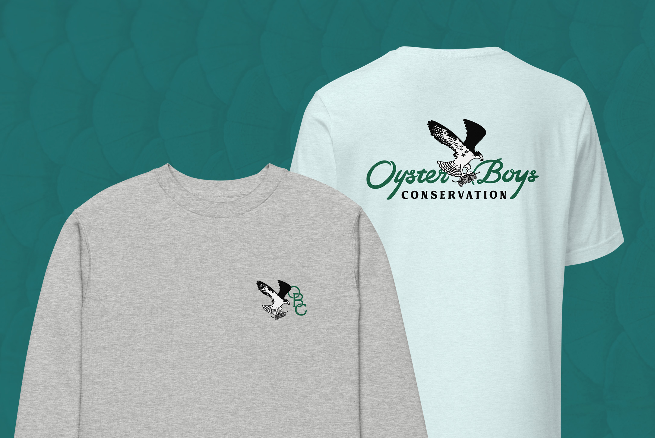
Oyster Boys Conservation is forging a new path in marine restoration, identifying as a grassroots movement built on grit. For their spring 2025 merch drop, I created a visual identity that complements their existing brand while carrying a few key elements to the forefront— strength, momentum, and an untamed edge— all grounded in purpose.
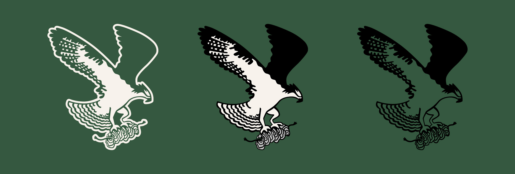
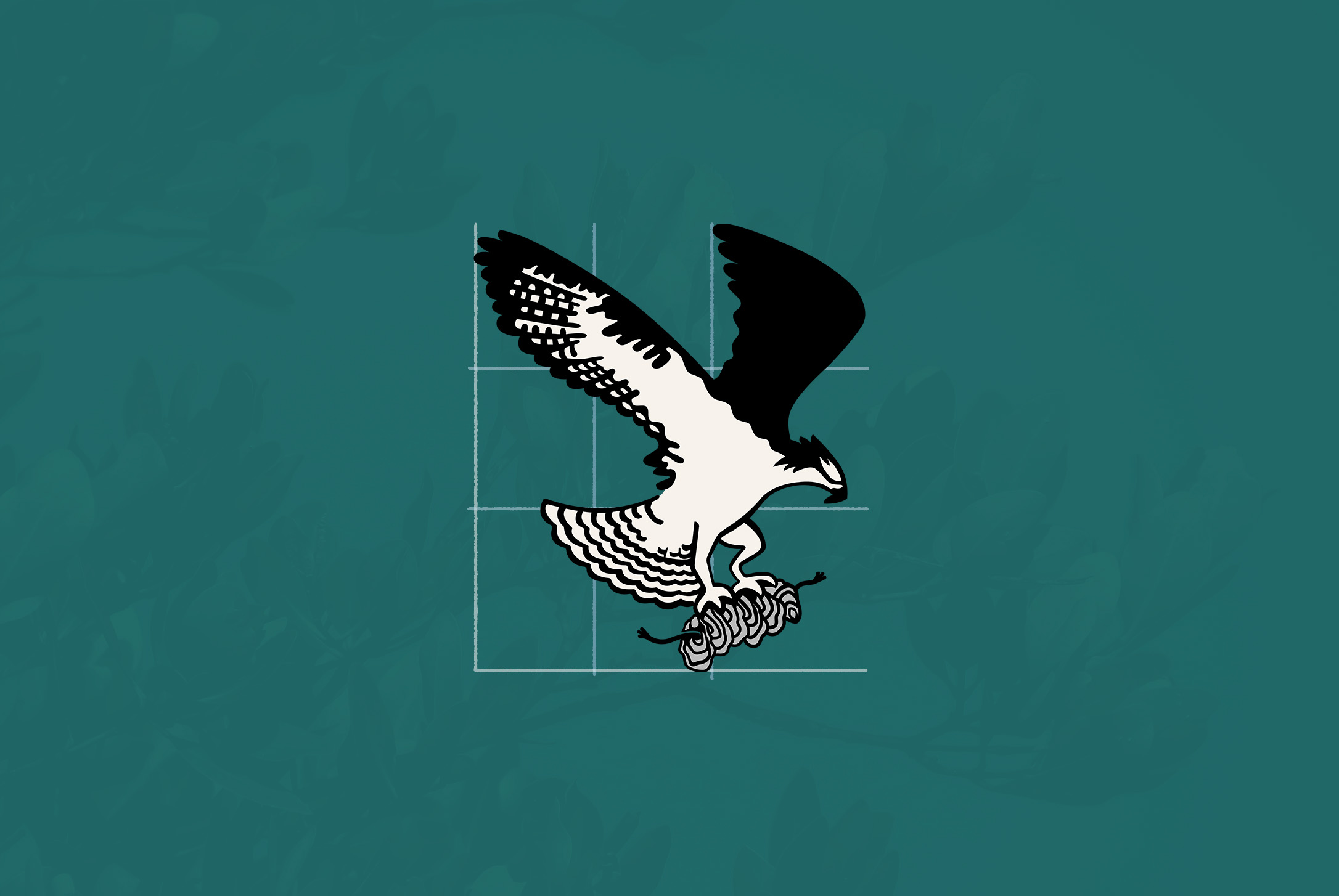
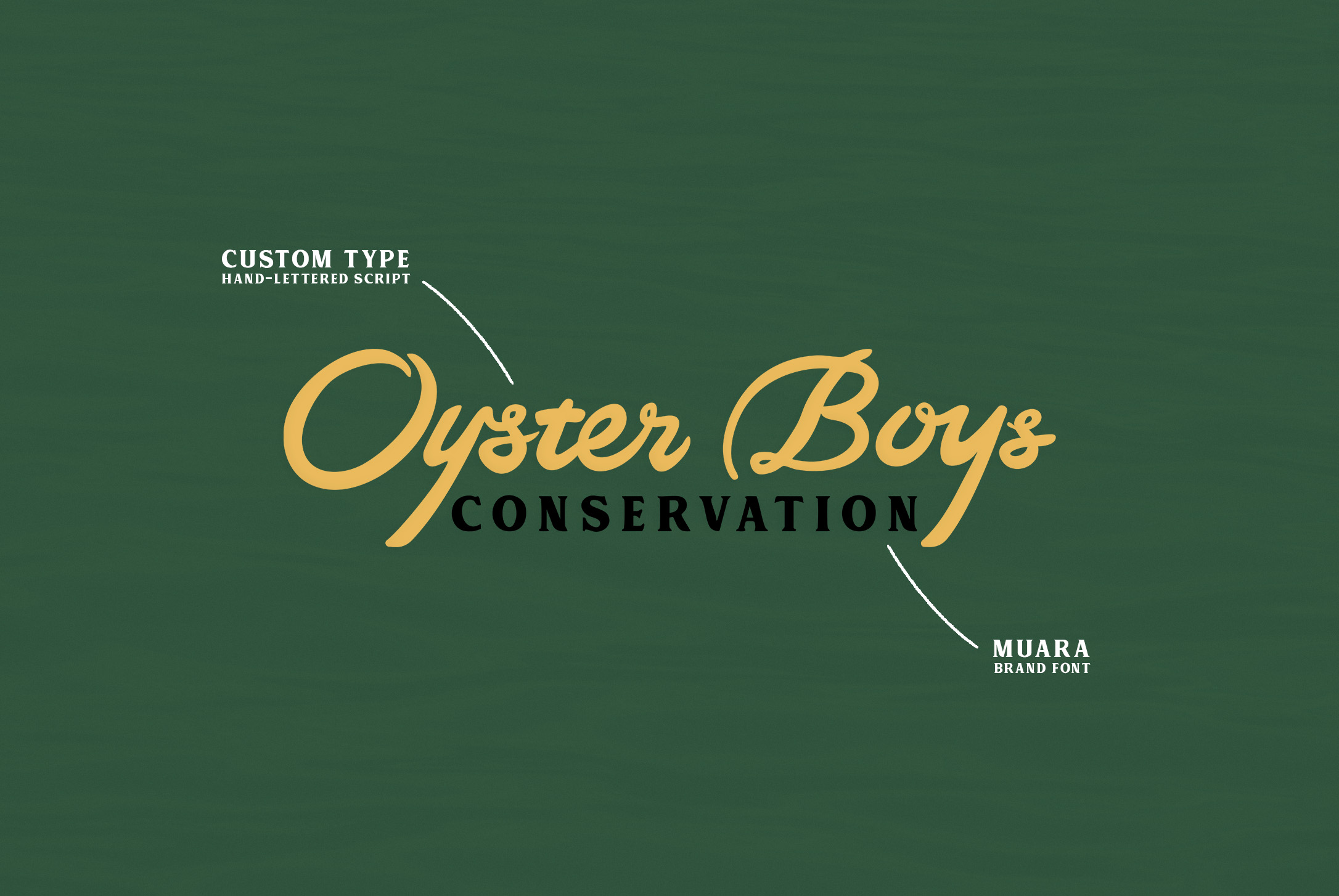
The centerpiece of the design features an osprey mid-flight, clutching a string of oysters—symbolizing resilience, restoration, and the wild harmony between predator and prey. This graphic, paired with a custom script wordmark and brand serif type drawn from maritime traditions, gives the artwork a bold, lived-in look that feels equally at home on a boat, a back road, or a city sidewalk.
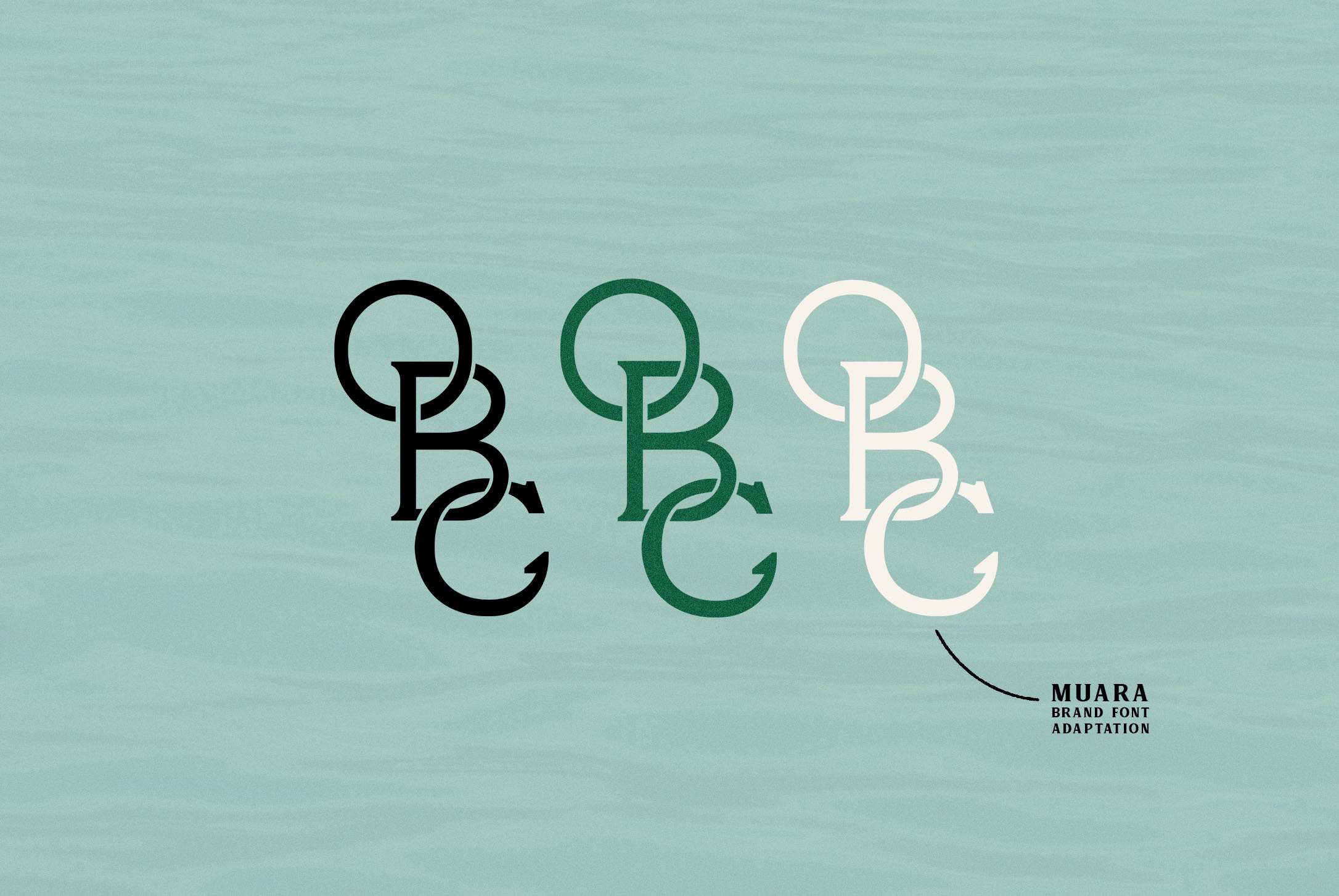
To accompany the main artwork, I designed a modular "OBC" monogram inspired by traditional cattle brands and adapted from the Muara brand font. The result is a mark that feels rugged, modern, and very much theirs.

Client
Boyd Industries, Inc.
Year
2025
Scope
- Brand Strategy
- Visual Identity
- Digital Design
- UI/UX Design
- Print Materials
- Brand Guidelines
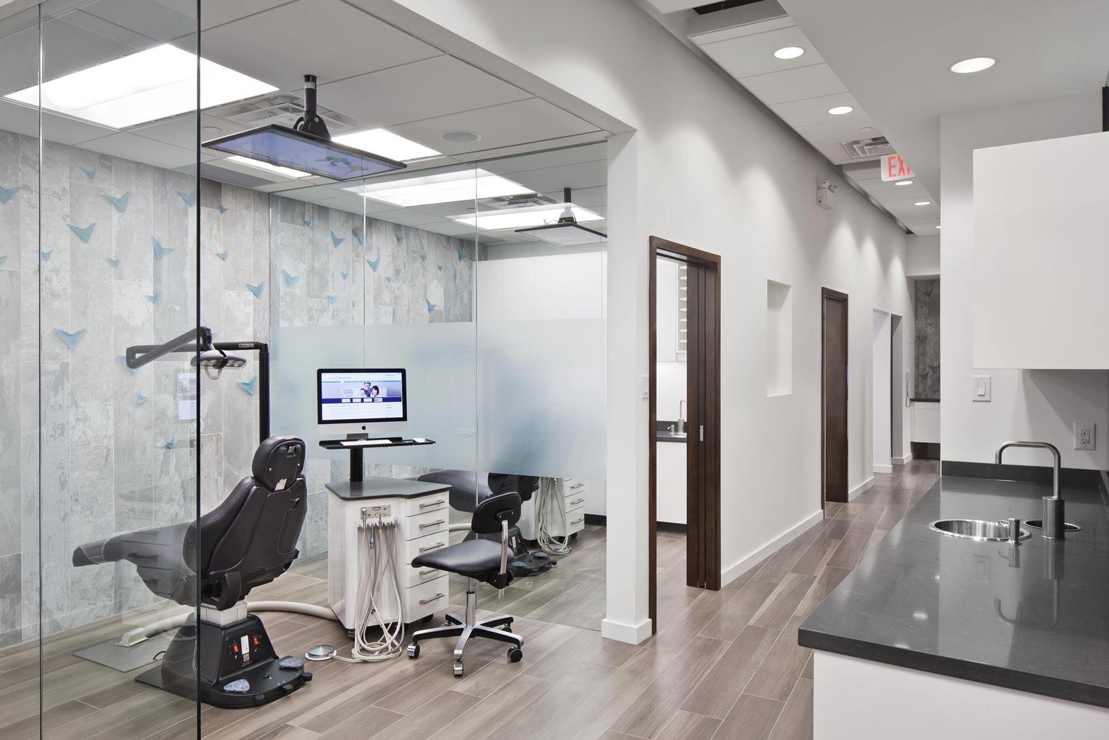
Boyd Industries, a 65+ year-old medical furniture design company, needed a brand refresh to reflect their tech-forward evolution while honoring their legacy.
The goal was to modernize their visual identity and create a cohesive system that works across digital platforms, product interfaces, and traditional marketing materials—with a focus on UX/UI design that prioritizes clarity and accessibility for medical professionals.
Creative Direction
Kate Andersen
Brand Strategy
Kate Andersen
UI/UX Design
Kate Andersen
Client
Boyd Industries, Inc.
Adrian LaTrace, CEO
Project Information
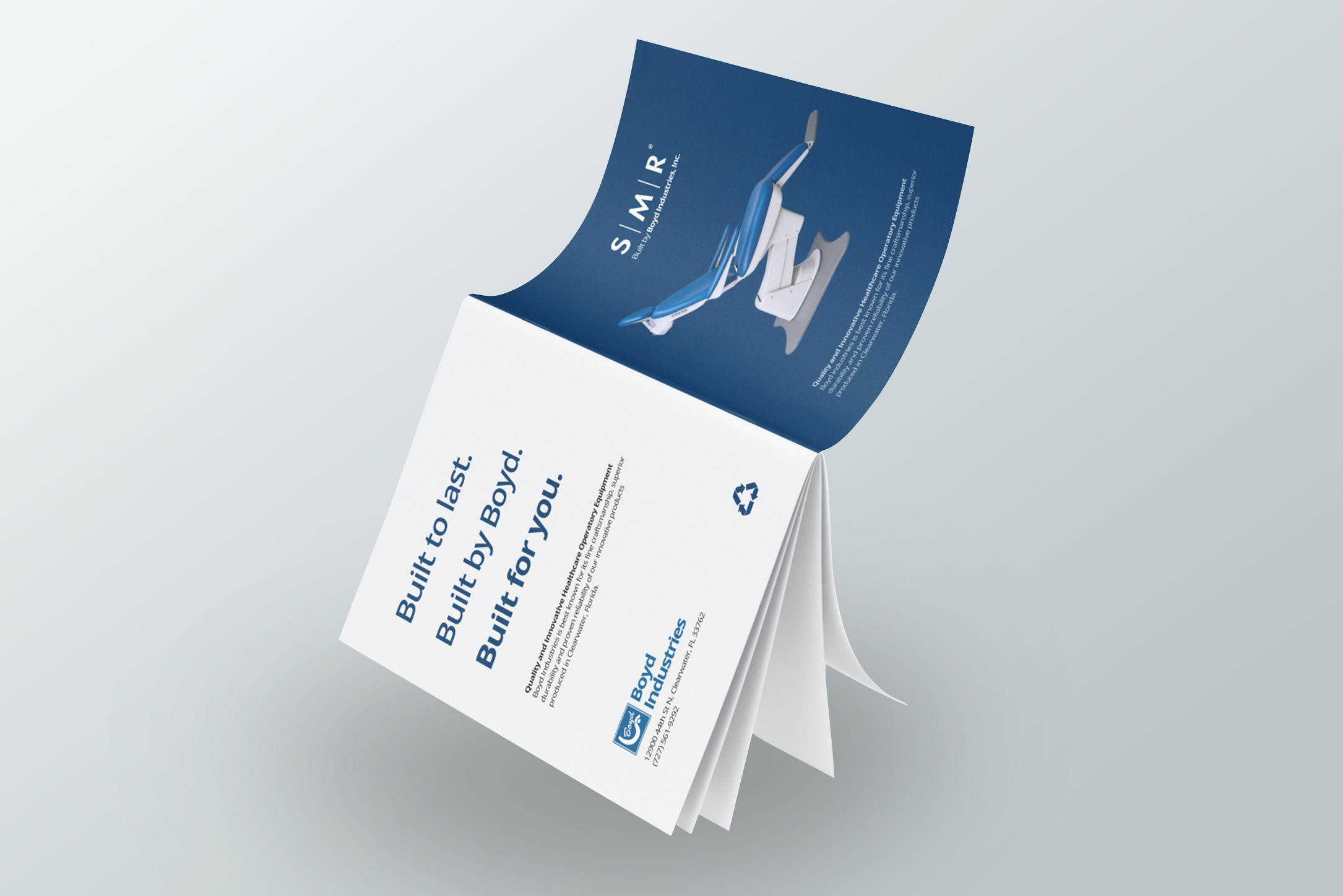
With over 65 years of expertise in specialty dental and medical furniture, Boyd Industries has long been known for its craftsmanship and reliability. But as the company expanded into new markets—most notably through the acquisition of SMR, a premium ENT equipment line—it became clear the brand needed a visual system that could reflect its evolution.
The rebrand was driven by a desire to elevate Boyd's identity to match the quality of its products, while clarifying its growing brand architecture. The challenge was to modernize the brand without losing the equity built through decades of trust—especially in the dental market where Boyd is a category leader.
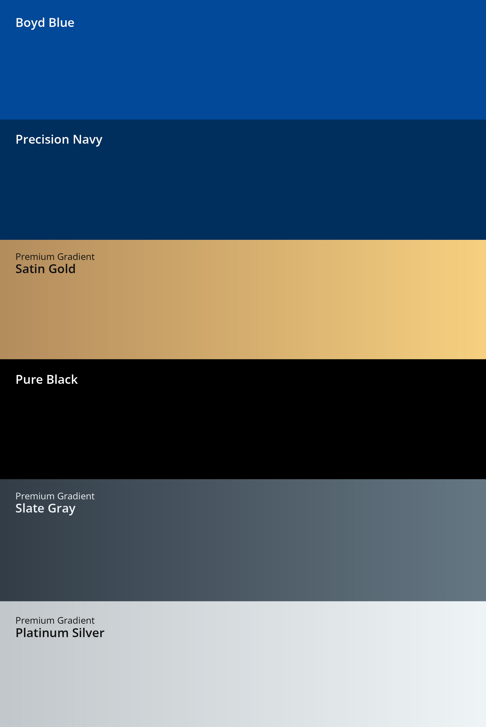
Inspired by the company's Clearwater roots and local supply chain—a key differentiator in an increasingly globalized industry—the new color palette incorporates Boyd Blue and Precision Navy, alongside a suite of metallic gradients: Platinum Silver, Satin Gold, and Slate Gray. These tones emphasize the durability and customization of Boyd's steel-based equipment, signaling a premium, future-facing brand built on solid foundations.
I redesigned the Boyd logomark with custom script and visual refinements to enhance legibility and modern appeal, while updating the broader logo system to feel more cohesive across all subsidiaries. New brand and photography guidelines were created to ensure consistency across marketing and sales materials—helping internal teams deliver a unified, elevated user experience.
I also led the UX/UI design and development of Boyd's new website, which has successfully launched the new visual identity across digital platforms. The UX strategy prioritizes clarity, efficiency, and accessibility and helps present Boyd Industries as a modern leader in healthcare equipment.
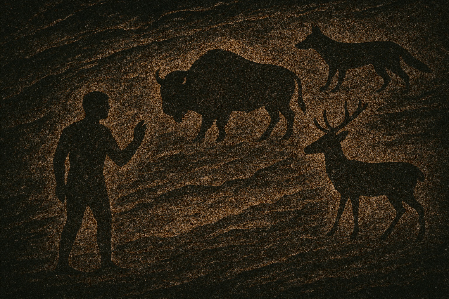
Procreate, 2024.
After Effects, 2024.
Procreate, 2024.
Client
The Scroll
Year
2025
Scope
- UX/UI Design
- Web Development
- Visual Design
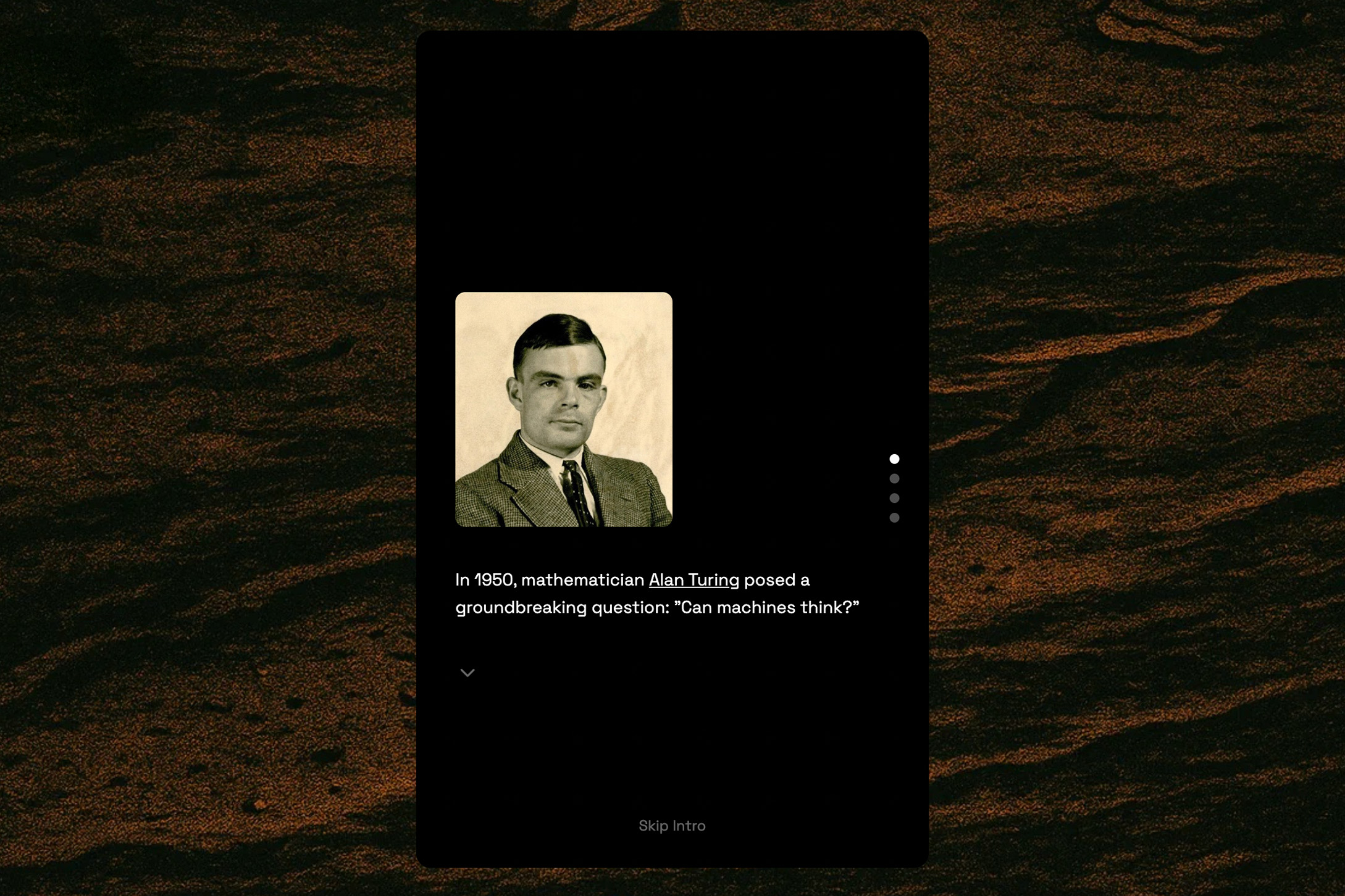
The Scroll is a web app that challenges players to tell real images from AI-generated ones.
Designed with a minimalist, intuitive interface, the game explores how human perception is evolving in the digital age. Encouraging transparency, mindfulness, and a sense of personal responsibility in the consumption and production of media.
Exhibited in December 2025 at The Vestibule in Seattle, WA. Open to the public online at thescroll.app.
Creative Direction
Kate Andersen
UX/UI Design
Kate Andersen
Development
Kate Andersen
Content
Sora
DALL-E
Midjourney
Public.Works
Unsplash
Pexels
Design & Documentation © 2025 Kate Andersen
Project Information
The Scroll emerges at a critical moment in our relationship with artificial intelligence, as the line between human and machine-generated content becomes increasingly blurred. This web application serves as both a game and a tool for developing digital literacy in an AI-dominated landscape.
The UX/UI design prioritizes clarity and focus, removing distractions to allow users to concentrate on the subtle details that often distinguish AI-generated images from human-created ones. Through careful information architecture and user flow design, the game tracks users' progress, offering reflections based on their performance and decisions at the end of each round.
The goal is to build a user's confidence in their own judgment while providing simple guidance and prompts for reflection. The experience evolves with the user through progressive disclosure and adaptive interfaces, introducing increasingly subtle distinctions as their discernment improves.
The project represents an increasingly relevant approach to education by being immersive, timely, and engaging for users with limited time or attention. So far, thousands of users have played the game. The tool will continue to evolve with AI's technological developments, as well as user feedback (please email hello@kateander.com with feedback or questions).